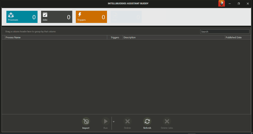
User Interface
Introduction
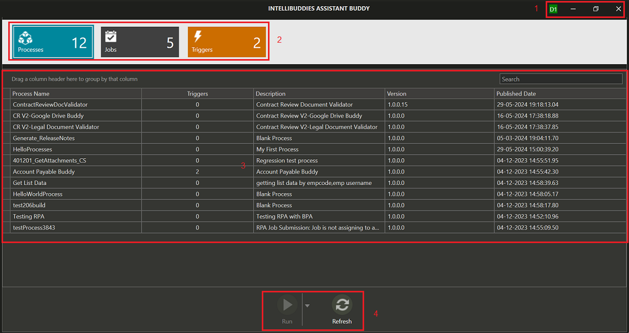
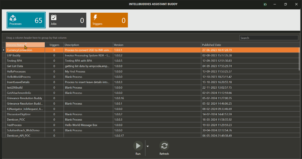
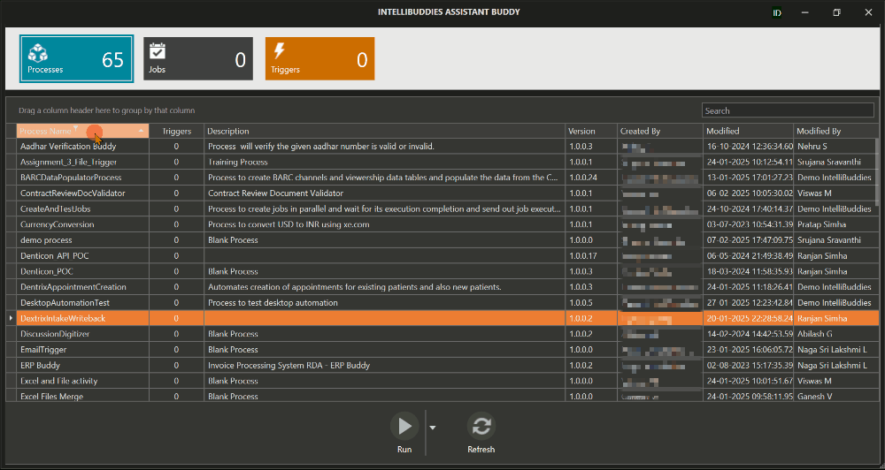
The user interface of Assistant Buddy has the following components.
| Sl# | Name | Description |
|---|---|---|
| 1 | Title Bar | Access and manage Assistant Buddy settings from this section. |
| 2 | Entity Panel | Select an Entity to view its corresponding data. |
| 3 | Data Panel | Displays the data related to the selected Entity from the Entity Panel. |
| 4 | Action Panel | Perform context-specific actions based on the Entity selected in the Entity Panel. |
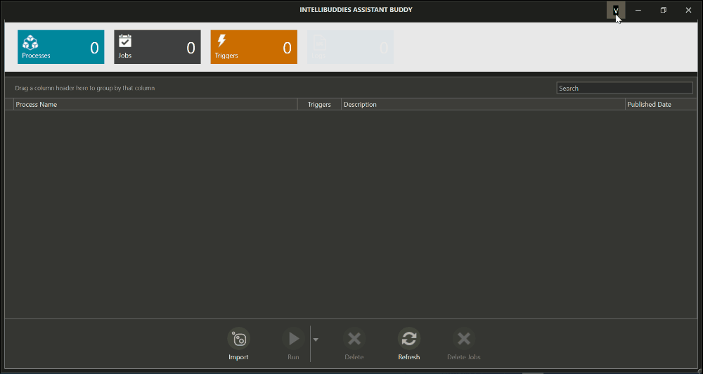
Title Bar
You can perform the following operations from here:
- View and configure your Assistant Buddy settings.
- Sign in or sign out from the AI Command Center. For more information on signing into AI Command Center, please refer: Signing into AI Command Center
Assistant Buddy Settings
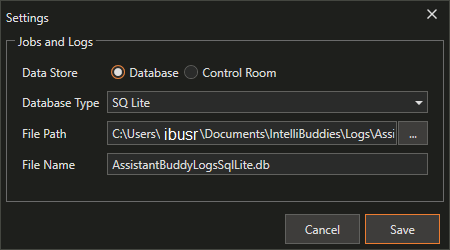
You can open the settings dialog by clicking on the logged-in user ID under the Title Bar and selecting Settings.
Storing Logs and Jobs - Enterprise Edition
- Store Logs either in local or AI Command Center Database - You can configure Assistant Buddy to utilize either the AI Command Center database or a local database to store all the Logs corresponding to the jobs executed by the buddy.
- Store Logs in AI Command Center

OR
- Store Logs in Local Database.
License Terms - Enterprise Edition
- You can open the License Terms by clicking on the logged-in user ID under Title Bar and selecting License terms.
- You can click on Sign Out by clicking on the logged-in user ID under Title Bar
Storing Logs and Jobs - Professional Edition
- Local Database to store Logs - You can configure a local database in Assistant Buddy settings to store all the Logs corresponding to the jobs executed.
License Terms and Status - Professional Edition
- You can open the License Terms by clicking on the logged-in user ID under Title Bar and selecting License terms.
- You can click on License Status by clicking on the logged-in user ID under Title Bar

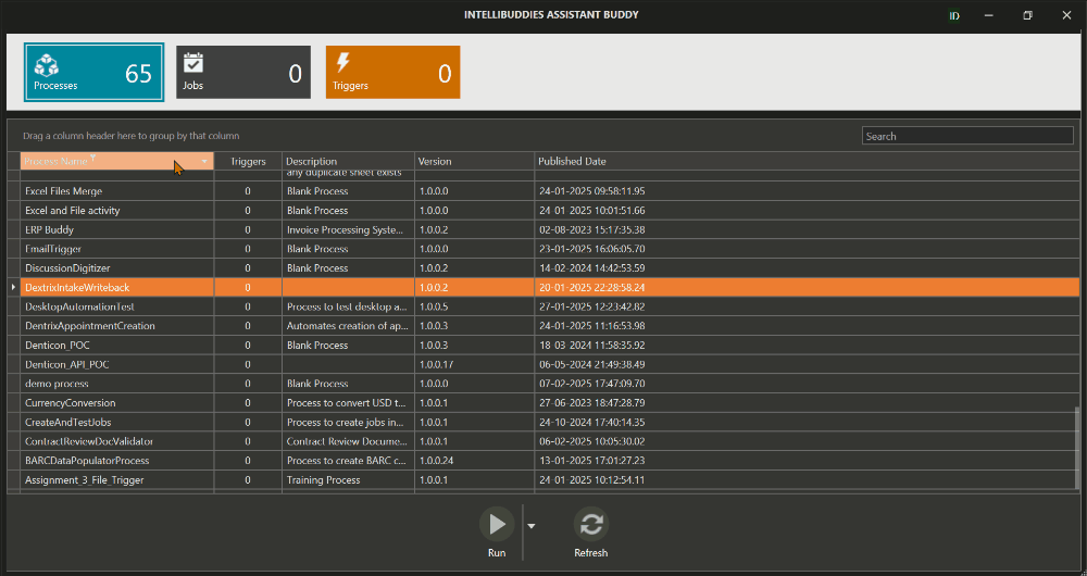
Entity Panel
The Entity Panel allows the user to select the Entity and perform a specific operation on the selected Entity. Here is the list of Assistant Buddy entities.
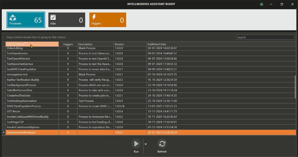
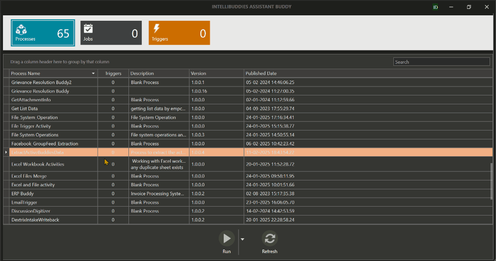
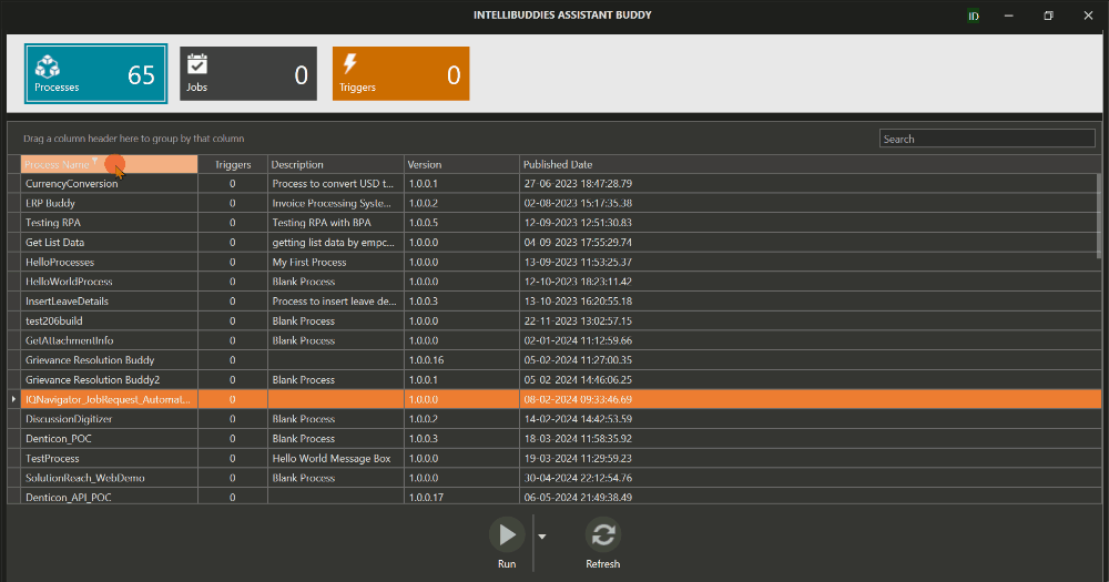
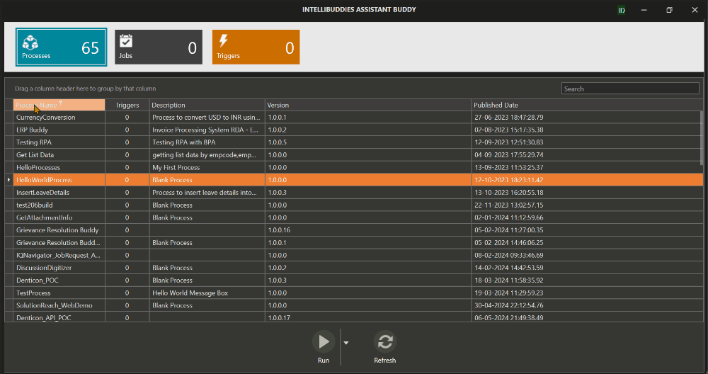
Processes
It will list all the processes that Assistant Buddy can execute. You can run a process on a demand basis.
Enterprise: Only those processes owned by or shared with the user associated with the Assistant Buddy will be fetched from the AI Command Center and listed.
Professional: The processes imported under this Assistant Buddy.
If you try to import a new process when the process count is already equal to the license count, you will receive an error Process count exceeds the licensed count. Please top-up your license and try again.
In these cases, you have to either top up your licenses to import new processes or delete some of the imported processes and release licenses for the new process.
Triggers
Triggers enable processes to be executed based on specific events. Assistant Buddy supports the following types of triggers.
- File System Trigger - associated with the events happening on a local file system
- Database Trigger - associated with the events happening on configured Database
- Process Trigger - associated with the events happening on starting and stopping of computer processes
- Hot Key Trigger - associated with pressing of keyboard Keys along with the combination of modifiers
You can manage your Assistant Buddy triggers, such as viewing, modifying, and deleting them from here.
Jobs
A job is an instance of process execution. You can view all the jobs the Assistant Buddy executes and the logs associated with that job execution.
Logs
The Logs that are associated with the Assistant Buddy. Each job might log multiple messages. These log messages get stored as part of Logs inside the SQL Lite database on the local system by default. Designers can extend the logging capabilities by pushing logs through WriteLog activity. IntelliBuddies supports the following severity levels when logging a message.
In the Enterprise edition, you have the option to push the logs into the AI Command Center database.
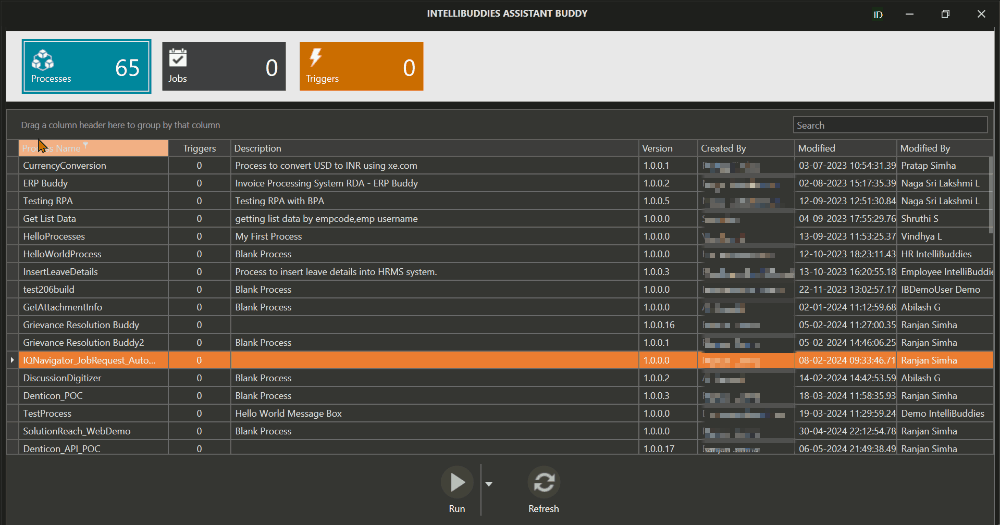
Data Panel
The Data Panel displays the data corresponding to the selected Entity from the Entity Panel. It presents the data in a grid format, where each row represents an individual item under that Entity for easy viewing and management.
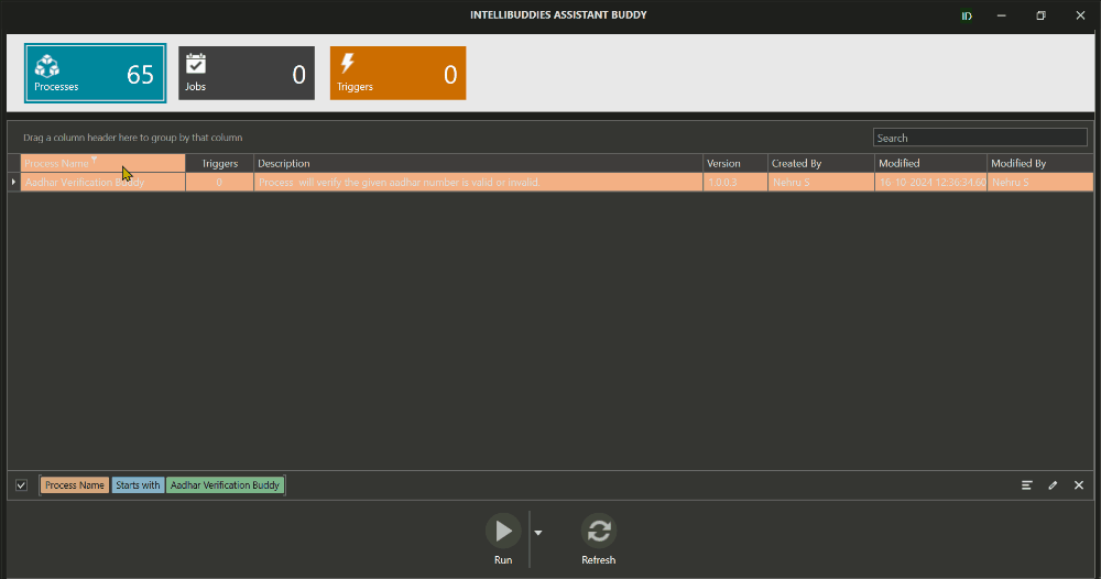
Data Panel Context Menu Options
The Data Panel offers a right-click context menu with various options to efficiently manage and represent data. This menu allows users to filter, sort, and group data within the grid, enabling a more customized and streamlined data view. These options enhance the user experience by allowing quick access to essential data manipulation features, ensuring efficient navigation and better control over how data is displayed and interacted with. The table below lists and describes each of these options.
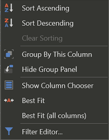
| Options | Icon | Description |
|---|---|---|
| Sort Ascending |  | Sorts rows in ascending order based on the selected column. |
| Sort Descending |  | Sorts rows in descending order based on the selected column. |
| Clear Sorting | Resets all sorting, restoring the DataGrid to its default order. | |
| Full Expand |  | Expands all grouped rows for easier data visibility. Available when right-clicking a column in the group panel. |
| Full Collapse |  | Collapses all grouped rows to streamline data presentation. Available when right-clicking a column in the group panel. |
| Group By This Column |  | Groups rows by the selected column, organizing them into collapsible sections for better data analysis. |
| UnGroup |  | Removes grouping based on the selected column. Available when right-clicking a column in the group panel. |
| Hide Group Panel |  | Hides the group panel from the interface. |
| Show Column Chooser |  | Opens a panel to customize the DataGrid by showing or hiding specific columns. |
| Best Fit |  | Adjusts the width of the selected column to fit its content for optimal readability. |
| Best Fit (all columns) | Adjusts all column widths to fit their content for a clean and organized display. | |
| Clear Filter |  | Removes applied filters, restoring the original unfiltered dataset. |
| Filter Editor |  | Provides an interface to create and manage advanced filtering criteria for precise data refinement. |
Sort Ascending
In an entity dataGrid, Sort Ascending arranges the rows based on the values in a selected column, from the lowest to the highest, either numerically or alphabetically (e.g., A to Z or 0 to 9).
Sort Descending
In an entity dataGrid, Sort Descending arranges the rows based on the values in a selected column, from the highest to the lowest, either numerically or alphabetically (e.g., Z to A or 9 to 0).
Clear Sorting
In an entity dataGrid, Clear Sorting removes any sorting applied to the columns, restoring the rows' order to their original, unsorted state based on the default display.
Group By This Column
In an entity dataGrid, Group By This Column groups the rows based on the values in the selected column, organizing them into collapsible sections for more straightforward analysis and comparison of related data.
Hide Group Panel
In an entity dataGrid, Hide Group Panel removes the group panel from the view, hiding where users can drag and drop columns to group the data, simplifying the interface.
Show Column Chooser
In an entity dataGrid, Show Column Chooser opens a panel that allows users to show or hide specific columns, enabling a customized view of the data.
Best Fit
In an entity dataGrid, Best Fit automatically adjusts the width of the selected column to fit its content, ensuring optimal readability and efficient space utilization.
Best Fit (all columns)
In an entity dataGrid, Best Fit (All Columns) automatically adjusts the width of all columns to fit their content, ensuring a well-organized and readable display.

Clear Filter
In an entity dataGrid, Clear Filter removes all applied filters from the data, restoring the entire dataset to its default view.
Filter Editor
In an entity dataGrid, Filter Editor provides an interface for creating, modifying, and managing complex filtering conditions to refine the displayed data based on specific criteria. Here are the options inside the Filter Editor
- Logical Conjunctions
| Option | Description |
|---|---|
| AND | Performs logical AND operation between the selected expressions |
| OR | Performs logical OR operation between the fixed terms |
| Not And | Performs a logical Not And operation between the selected expressions, returning false only when all expressions are true. |
| Not Or | Performs a logical Not Or operation between the selected expressions, returning true only when all expressions are false. |
- Insert or Add Key - Click the + button to add a new condition to the group.
- Delete or remove key - Click the x button to delete or remove an added condition. The button becomes available after a condition is added.
- Drop-down options - Alternatively, click the drop-down menu to select from the available filter condition types.
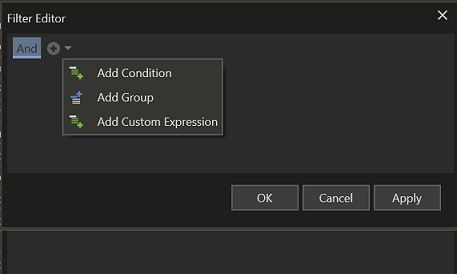
| Option | Description |
|---|---|
| Add Condition | Select this option to add a new condition. |
| Add Group | Select this option to add a new group. |
| Add Custom Expression | Select this option to add a custom expression in the Expression Editor dialog. |
Action Panel
The Action Panel provides various operations for users on the selected Entity.