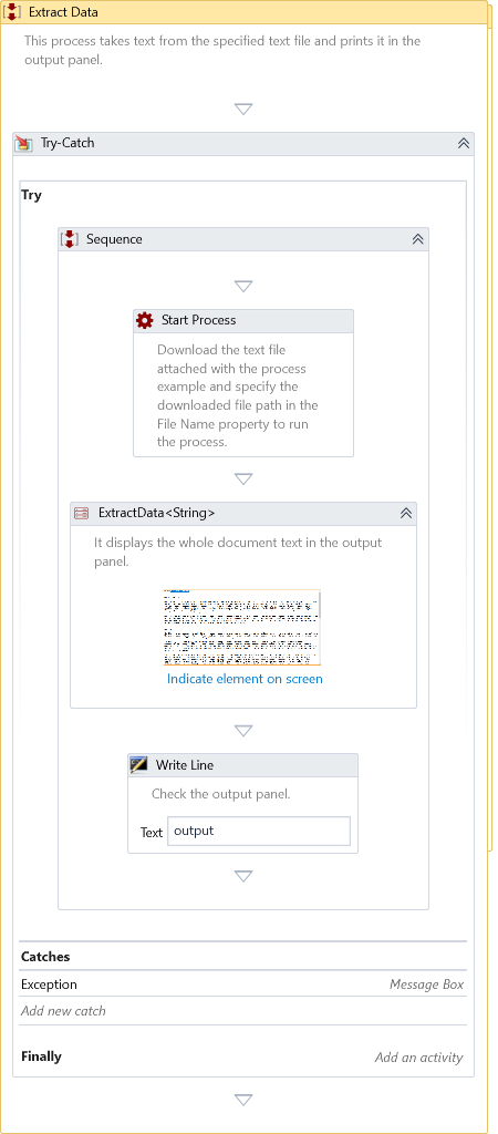
Extract Data
Description
Extracts the data from the selected element
This activity requires an active display and an unlocked user session to simulate interactions with UI components successfully. For more detailed information, please refer to the relevant section in the Desktop Automation Notes.
Properties
Input
-
Search Parameters – Specify the list of conditions to hold the information of the UI element identified through Element Selector.
-
Window Instance - Specify the window instance identified through Window Selector. You can also type in the window instance for automation.
Misc
-
DisplayName – The display name of the Activity.
-
Private – By default, Activity will log the values of your properties inside your workflow. If private is selected, then it stops logging.
-
Result Type – Choose the result type from the dropdown matching the kind of value extracted based on the control type of the selected element. If the control type mismatches the result type, the Activity will throw a type conversion error. Suppose the user selects the control not listed in the following table. In that case, the Activity will return the Name of that element.
| Control Type | Result Type | Result |
|---|---|---|
| Window | String | Title of the window |
| Text | String | Selected text |
| Button | String | Name of the button |
| Split Button | String | Name of the button |
| Edit | String | Text of the edit control. E.g., Text of text box |
| Document | String | Text of the document |
| Hyperlink | String | Text of the hyperlink |
| Menu Item | String | Content of the menu item |
| Menu Bar | List<String> | Content of the selected menu items in the menu bar |
| Menu | List<String> | Content of the selected menu items in the menu |
| List Item | String | Content of the list item |
| List | List<String> | Content of the selected list items in the list |
| Tree Item | String | Name of the tree item |
| Tree | List<String> | Name of the tree items in the tree |
| Tab Item | String | Name of the tab item |
| Tab | String | Name of the selected tab item in the tab |
| Header Item | String | Name of the header item |
| Header | List<String> | Name of the header items in the header |
| Data Item | List<String> | Contents of the data item |
| Combo Box | List<String> | Selected items in the combo box. Returns all items if no item is selected. |
| Slider | Double | Value of the slider |
| Progress Bar | Double | Value of the progress bar |
| Scroll Bar | Double | Value of the scroll bar |
| Spinner | Double | Value of the spinner |
| Radio Button | Boolean | State of the radio button |
| Check Box | String | State of the check box. True - If the state is checked. False - If the state is unchecked. Indeterminate - If state is indeterminate. |
| Calendar | List<DateTime> | Selected dates in the calendar |
| Custom | String or DataTable | Contents of the custom contol |
| Pane | String or DataTable | Contents of the pane |
| App Bar | String or DataTable | Contents of the app bar |
| Title Bar | String or DataTable | Contents of the title bar |
| Group | String or DataTable | Contents of the group |
| Table | DataTable | Contents of Table |
| Datagrid | DataTable | Contents of data grid |
Optional
- Timeout – Specifies the maximum duration the activity will wait for a response to perform the requested operation. A timeout error occurs if no response is received within the specified time. The default timeout is 30 seconds.
- Continue On Error – Specifies if the automation should continue even when the Activity throws an error. This field only supports Boolean values (True, False). The default value is False.
Catches no error if this Activity is present inside the Try-Catch block and the value of this property is True.
Output
- Result - Returns the data extracted from the selected element as specified in Result Type.
Example
Download Example
