Form Designer
IntelliBuddies provides, as part of the platform, the ability for web application developers to create Forms for their process automation using a simple drag-and-drop form builder.
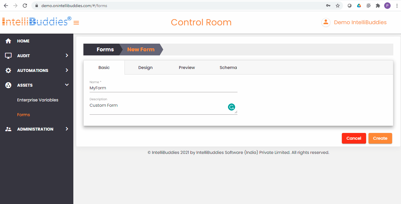
You can create custom forms and utilize them in your automation. You can download and share the Form with other teams. You can do all these things under the Forms page inside Control Room.
Creating a Form
You can create a new Form for your automation by clicking on Toolbar-Menu >  button under Forms page. The Form Designer UI pops up. It is a wizard-based UI and helps you design your Form with ease. The Form Designer wizard has the following tabs.
Basic Information
You provide basic information about this Form under this tab. The following information is extracted as part of this tab.
| Field | Description |
|---|---|
| Name | Provide a name to this Form |
| Description | Type in the description for this Form |
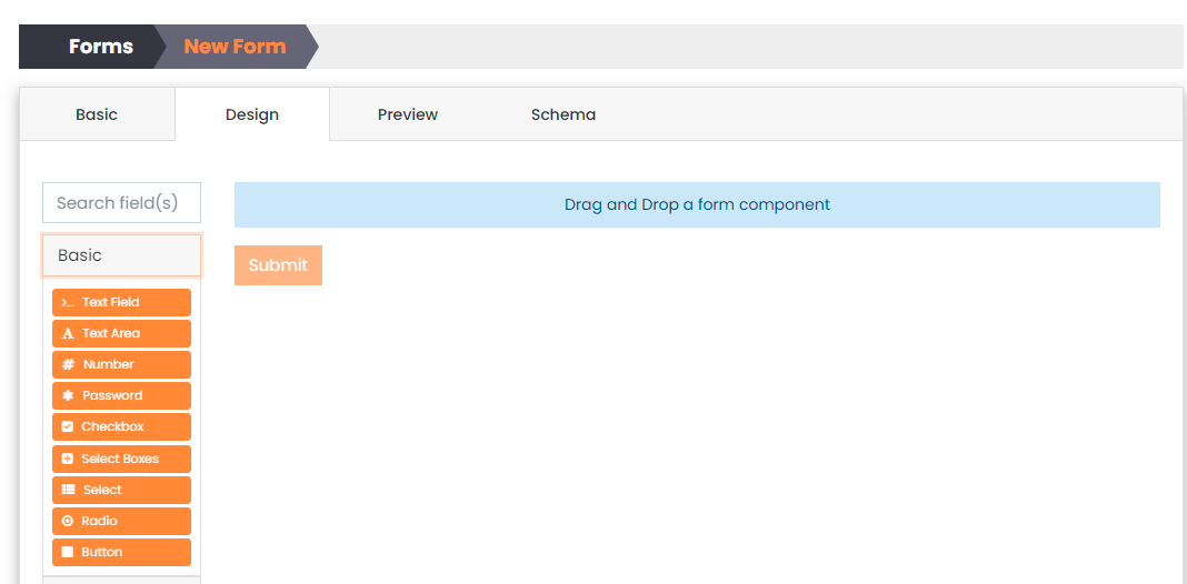
Design
The Design tab gives you access to the entire Form design components to build your Form. You can drag and drop a design component from the left side of this wizard and create your custom Form.
There are five design component categories exposed as widgets in the Design tab. The categories are:
Basic Components
This category contains the basic and the most used Form field components, such as Text, Number, Checkbox, Buttons, and others.
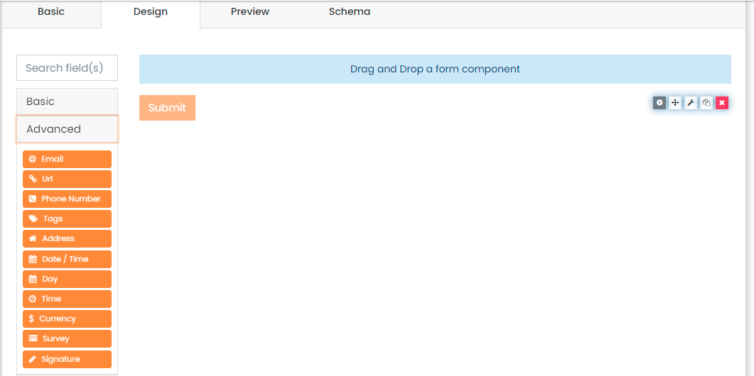
Advanced Components
This category contains more complicated fields, such as Email, Links, DateTime, Phone Number, Currency, and others.
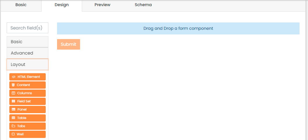
Layout Components
This category contains layout components that enable you to design your form layout by adding Tabs, Panels, Tables, Columns, and others.
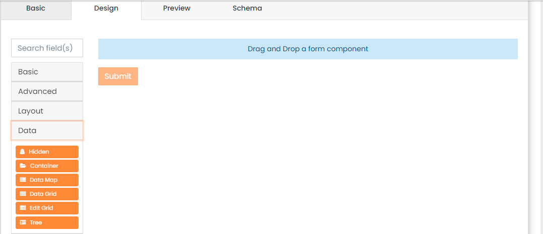
Data Components
This category contains components such as Grids, Trees, and others through which you can present your data.
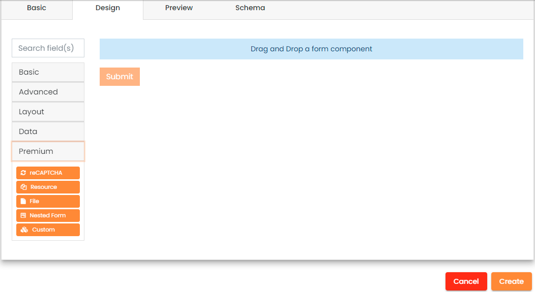
Premium Components
This category contains premium components such as File Attachments, Captcha Controls, and others.
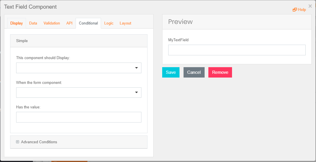
Field Customization
Once you have dragged and dropped a Field inside a Form Designer canvas, a Form Field customization wizard pops up. This wizard will enable you to customize your Field according to your needs. This wizard contains the following tabs.
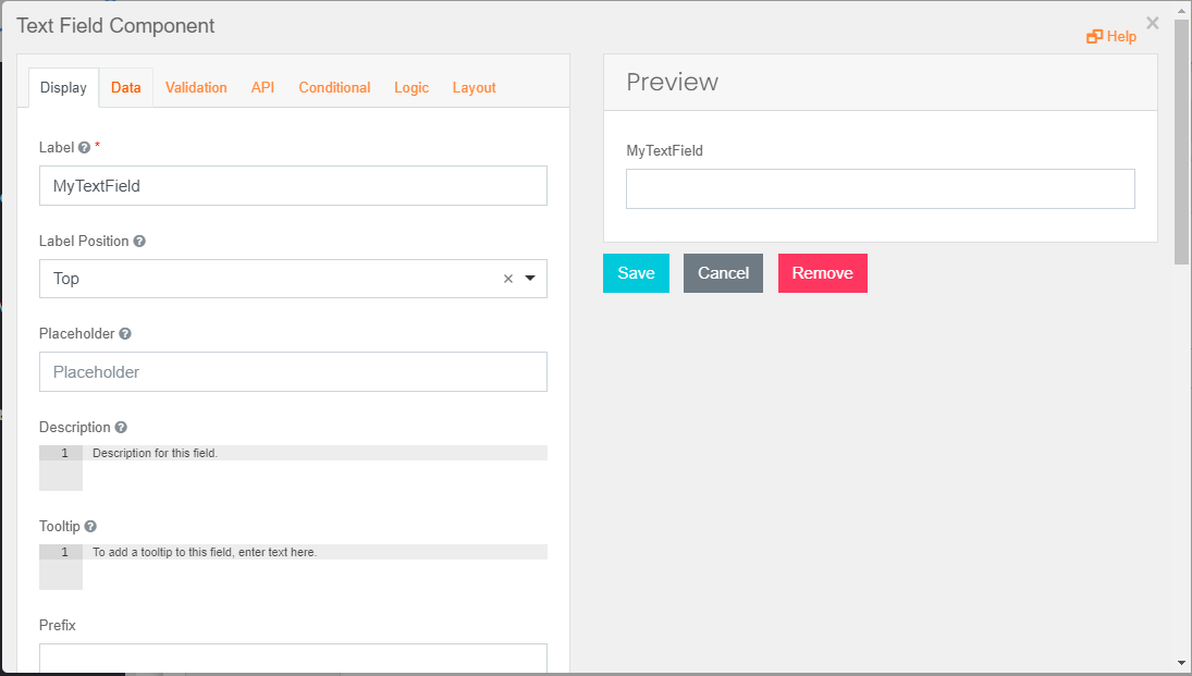
Display
You can modify the appearance of the Field inside the Form from this tab.
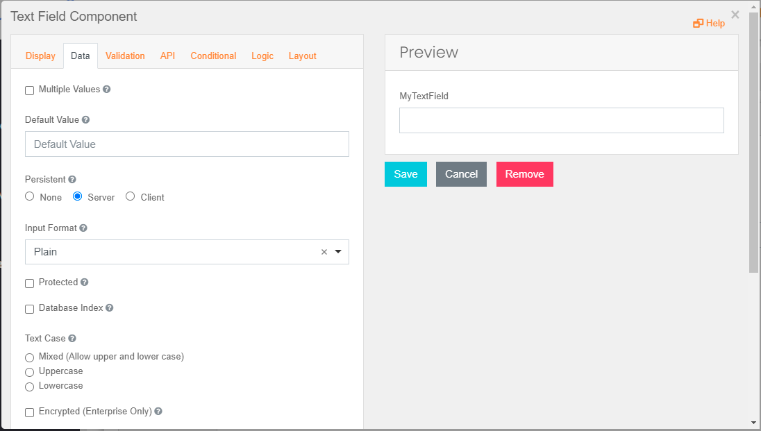
Data
You can configure the data associated with this Field, such as providing default value and others from this tab.
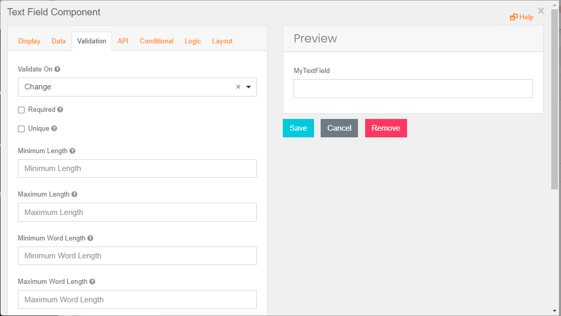
Validation
You can configure data validations for the Field from this tab.
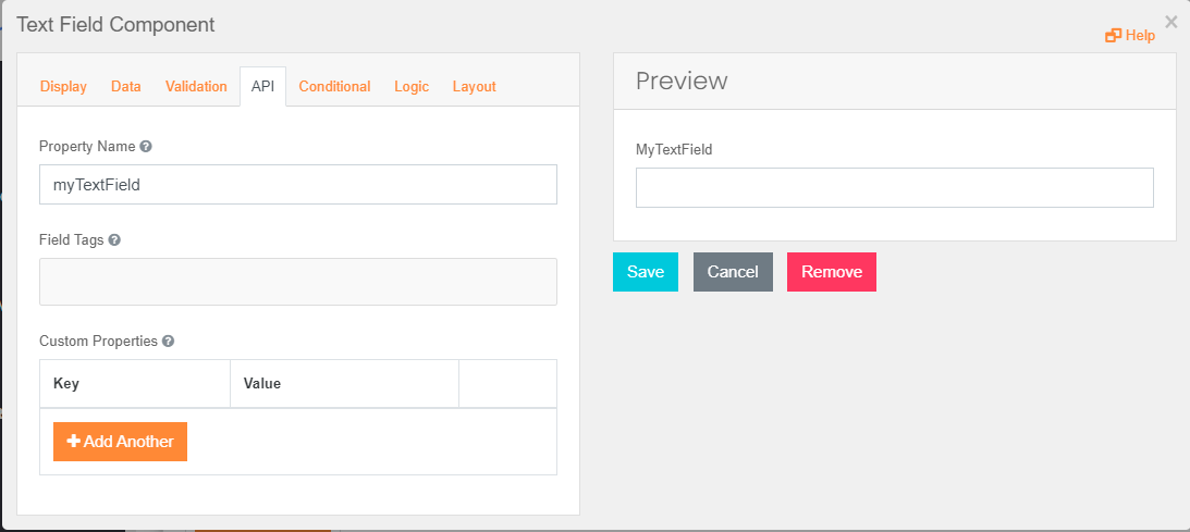
API
Please specify the name for this Field to map it with workflow variables.
Conditional
You can configure conditions that dictate this Field's appearance based on specific actions on other Fields from this tab.