Display Settings
Overview
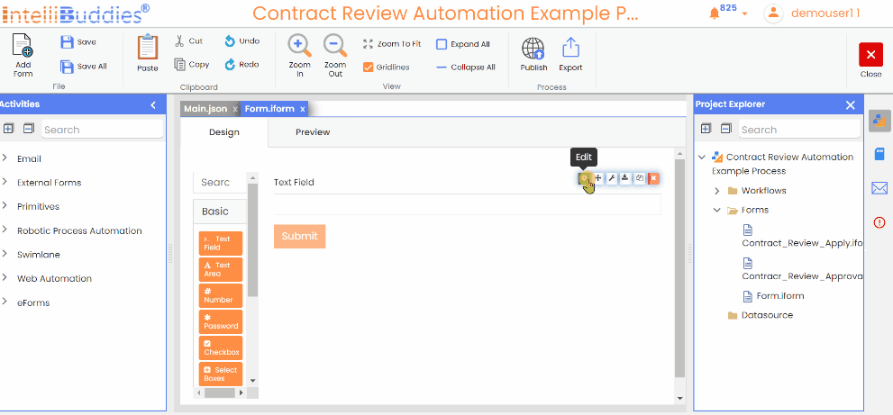
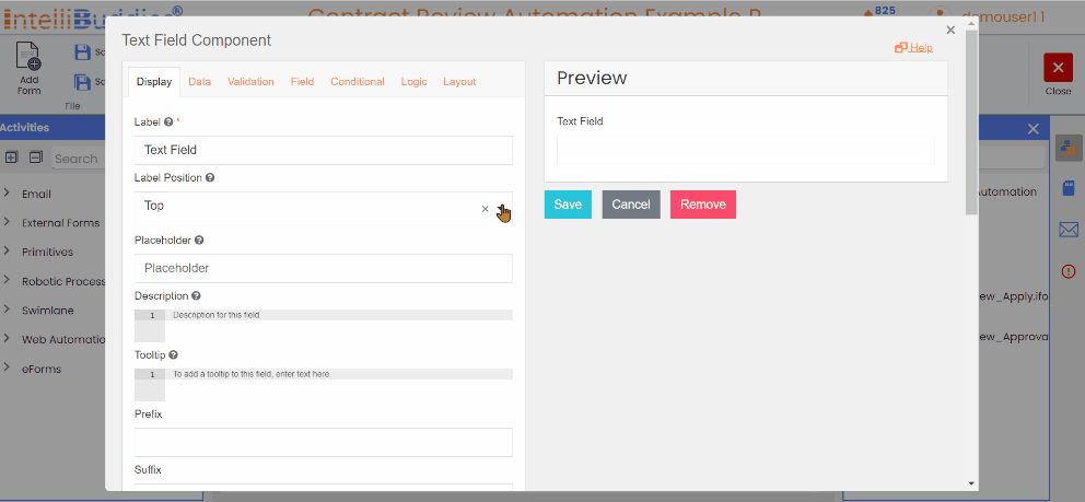
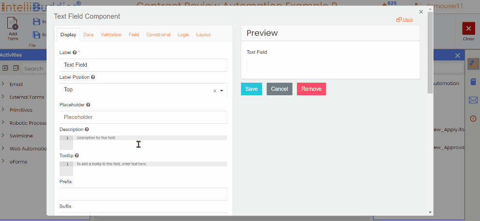
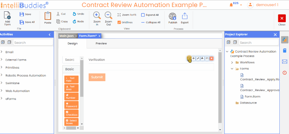
When editing the settings of a component, the Display tab will now be the first one open. This tab pertains to modifying the front-end UI.
Label
The component's front-end name. The Label displays above the field by default.
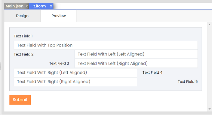
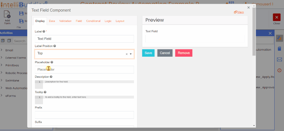
Label Position
The label location of the component. The Lable Position will default to the Top option, but you can select several other options:
| Location | Description |
|---|---|
| Top | The Label will be positioned at the top of the component and aligned to the left. |
| Left (Left-aligned) | The Label will be displayed to the left of the component and aligned with the component's width span. |
| Left (Right-aligned) | The Label will display to the left of the component and aligned to the right of the component width span. |
| Right (Left-aligned) | The Label will be aligned to the left of the component width span and displayed on the right side of the component. |
| Right (Right-aligned) | The Label will display to the right of the component, aligned with the left edge of the component's width. |
| Bottom | The Label will display left-aligned below the component. |
On choosing either the Left or Right alignment options, padding is applied to the corresponding side of the component, resulting in space between the Label and the component.
Format your form in a grid or save vertical space using the label position.
Placeholder
It is a short description of the expected value to enter the field. Placeholder displays when the field is empty and is not submitted.
Provide users with helpful guidance using the Placeholder feature as a form field helper text. Disappears when the user begins typing
Description
Add a description to display below the field. Use this instead of or in addition to the placeholder for more details.
To style the Description content, use HTML in the setting field.
Tooltip
Adding content to the Tooltip setting allows you to create a new UI element represented by a question icon. When users hover over this element, the content inside the Tooltip setting will appear. Tooltips are a helpful way to provide additional information or tips without cluttering your form.
To style the content inside the Tooltip, utilize HTML in the Tooltip setting field.
Prefix
The Prefix setting adds text or characters before the input field. Use this to categorize or label a field, like $, for US currency.
Suffix
The Suffix setting allows adding text or characters after the input field to help label or categorize a field. For example, you can use % to represent a percentage.
Widgets
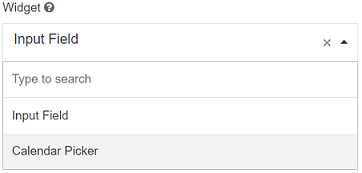
The widget serves as the display interface for entering the field's value. It is set as a standard input field by default, but you can modify it to transform the text field into a calendar picker.
Input Mask
An Input Mask is used to enforce a specific input format. This is particularly helpful for ensuring consistent formats for data such as phone numbers, postal codes, Social Security numbers, and similar information. Refer to Mask Definotion.
Display Mask
A display mask is used to format input in a more readable way for users, without altering the underlying value that is saved in the system. If you need the format to impact both the displayed value and the stored value, the Display Mask should be removed, and an Input Mask should be applied instead. Refer to Mask Definotion.
Mask Definition
| Mask | Description | Example |
|---|---|---|
| 9 | Numeric input (digits only). | Mask: (999) 999-9999 Expected Input: The user must enter a 10-digit phone number. The format will automatically insert parentheses and a dash. User Input: 1234567890 Displayed Value: (123) 456-7890 Saved Value: 1234567890 (without the formatting characters) |
| a | Alphabetical input (letters only). | Mask: aaa-AAA Expected Input: The user must enter three lowercase letters, followed by a dash, then three uppercase letters. User Input: abcDEF Displayed Value: abc-DEF Saved Value: abcDEF (same as displayed, but saved without the dash) |
| * | Alphanumeric input (either letters or digits). | Mask: a9*a Expected Input: The user must enter an alternating sequence of letters and numbers. User Input: A1B2C Displayed Value: A1B2C Saved Value: A1B2C (same as displayed) |
For more detailed configurations and advanced use cases, you can refer to the jquery.inputmask documentation.
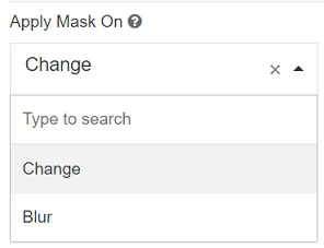
Apply Mask On
Choose the type of applying mask Change or Blur.
| Option | Description | Example |
|---|---|---|
| Change | This option visibly alters the content of the field when the user loses focus. This is ideal for scenarios where you want users to notice the changes made to the input. | For example, if a user enters a phone number like "1234567890," upon losing focus, the field could format it to display as "(123) 456-7890." |
| Blur | This option obscures the content of the field without altering the actual value once the user loses focus. This is suitable for sensitive information or when you want to maintain a level of privacy while still preserving the data. |
Allow Multiple Masks
This setting enables you to configure multiple input masks for a field. The user can select the desired mask from a dropdown list, and the field will dynamically adjust to the chosen mask.
Input Mask Placeholder Char
Use this option to choose a specific character to act as a placeholder in an input field. A placeholder is a visual cue that indicates where the user should enter information. For example, you might choose the underscore character (ˍ) as a placeholder, it will be displayed in the input field to guide users on what to enter.
- Suppose you set an input mask as (999) 999-9999 and use ˍ as the placeholder.
- Initially, the input field may display as (ˍˍˍ) ˍˍˍ-ˍˍˍˍˍˍ to indicate that the user should enter numbers in those positions.
- Once the user starts typing their phone number, the placeholder characters (ˍ) would be replaced by spaces or removed, making it clear where they should input data.
Custom CSS Class
Enhance the appearance of your fields with personalized styling by adding Custom CSS Classes. IntelliBuddies form designer uses Bootstrap as the default CSS framework for the renderer. Here are some examples of practical Custom CSS Classes and their respective codes.
Tab Index
To control the tab order of components on a form, set the Tab Index attribute of this component.
Autocomplete
Specifies whether input elements can, by default, have their values automatically filled by the browser. For more details, refer to the MDN documentation on autocomplete.
Hidden
Hidden components do not display on the form but are still part of the form JSON and submission. Configure Logic with Hidden components to facilitate conditional show and hide workflow.
Hide Label
Hiding a field label can save vertical space on a form. Instead, utilize other display settings like a Placeholder to identify the field.
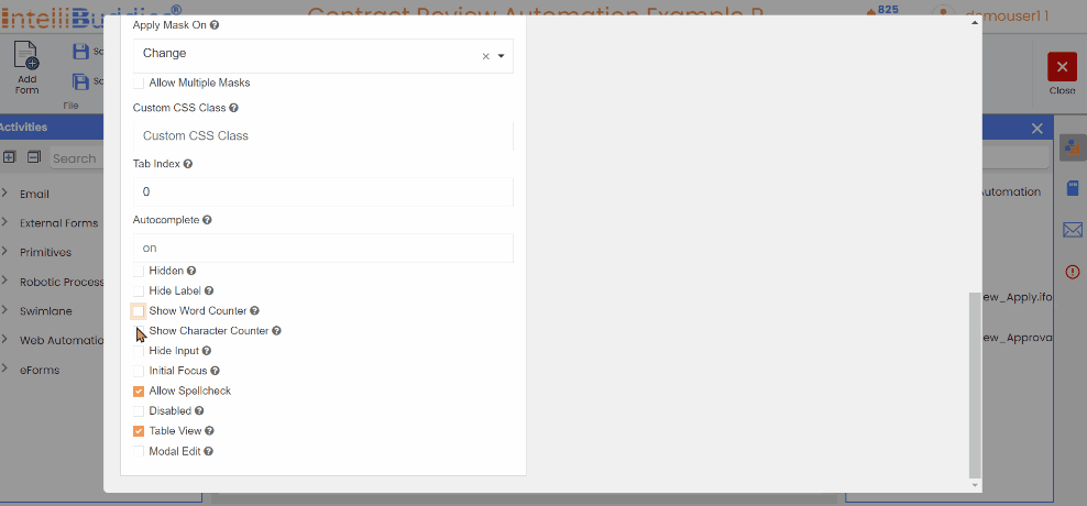
Show Word Counter
Display a real-time count of the total number of words entered in the text field. This live word count updates dynamically as the user types, providing immediate feedback on the number of words being input.
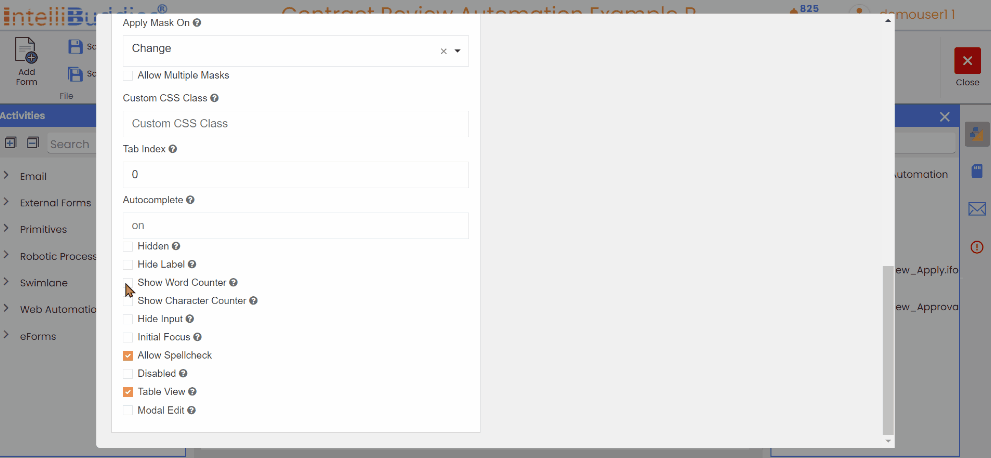
Show Character Counter
Display a real-time count of the total number of characters entered in the text field. This live character count updates dynamically as the user types, offering immediate feedback on the total number of characters being input, including spaces and punctuation. This feature helps users track the length of their input, especially when character limits are important.
Hide Input
Mask sensitive data inputs with circle characters (like password fields). Use this setting when dealing with sensitive data like Tax ID or Social Security Number.
The Hide Input setting does not encrypt data on the server and is not recommended for passwords.
Initial Focus
After the form is displayed, the component with Initial Focused selected will automatically receive focus.
Enabling the Initial Focus feature on a single component within the form is recommended for optimal performance. Only the final component in the JSON structure with the feature enabled will receive focus if multiple components are enabled.
Allow Spellcheck
The Allow Spellcheck option controls the browser's built-in spellcheck functionality for input fields. When enabled, the browser automatically checks the spelling of text users enter in fields such as text areas or input boxes. Underlines the misspelled words, and users may receive correction suggestions, depending on the browser’s spellcheck feature.
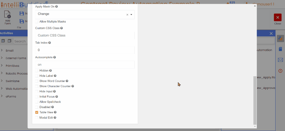
Disabled
The Disabled setting prevents users from inputting data into the field and is often used with calculated values to prevent users from altering calculations or populated values.
Table View
On checking the Table View setting, the field and underlying data display within the Submission Data Grid of the form. Irrespective of checking the settings, it saves data to the server.
Modal Edit
It opens a Modal Window to input or edit field data when clicked. When the field is empty, the placeholder text Click to set value. Will display in the field.