Component Settings
Description
Most components have unique settings, but some settings apply to all. These are called General Settings. Here's a list of them, organized by type.

Display Settings
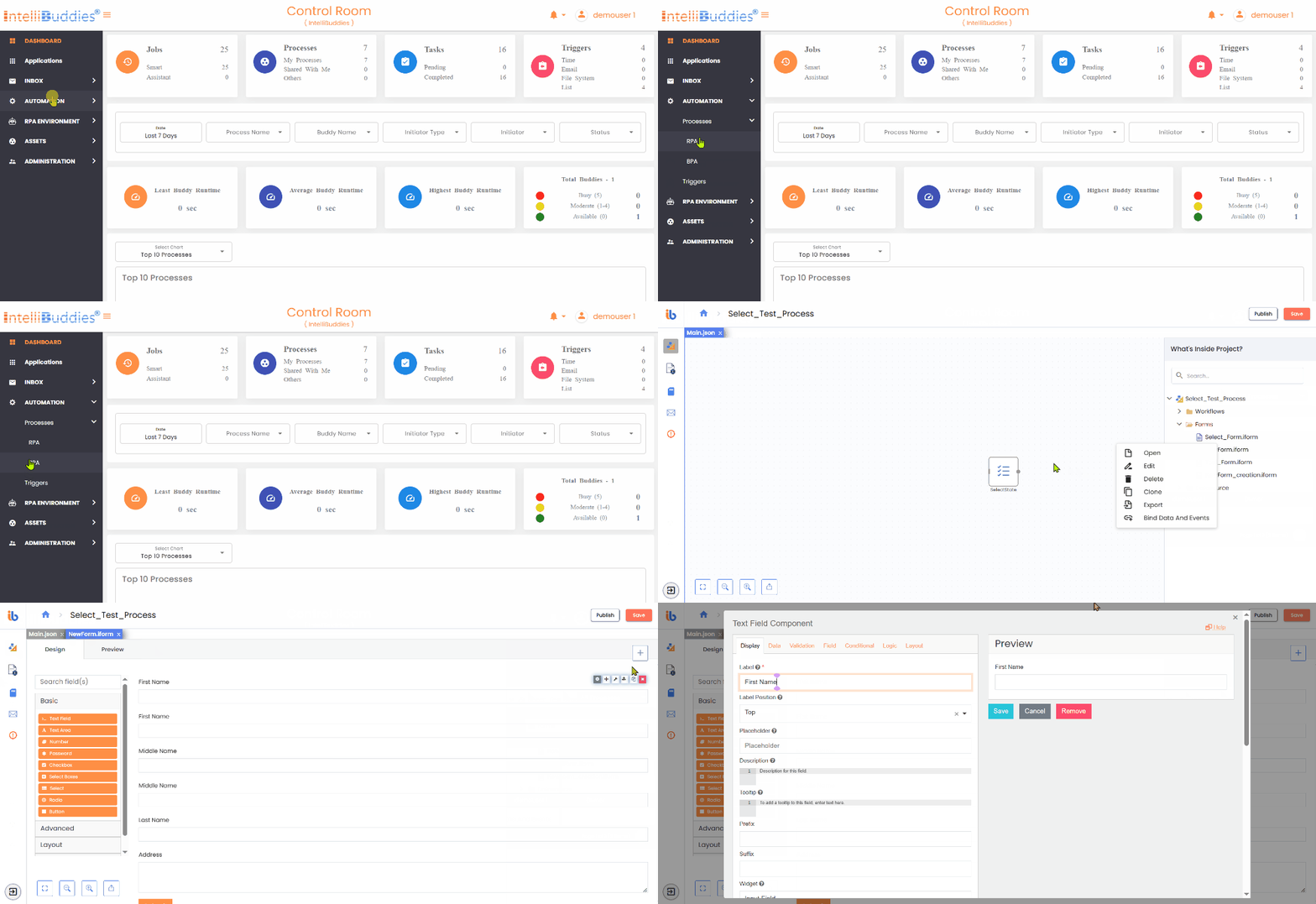
When editing the settings of a component, the Display tab will now be the first one open. This tab pertains to modifying the front-end UI.

File Settings
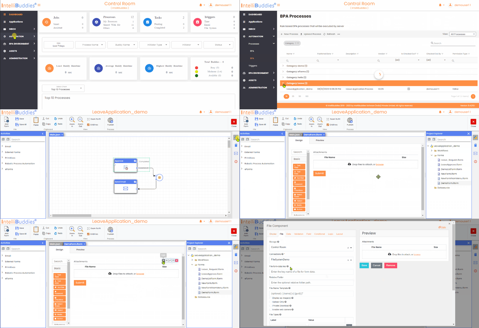
When editing the settings of the Attachment component, use the File tab to configure file settings.

Data Settings
Data settings control how data is interacted with in fields. Use it to set default values or perform data calculations.

Validation
The Validation Tab settings control Front-End and Back-End validations for fields. It includes required fields, unique data, min/max requirements, custom validations, and error messages.

Field Settings
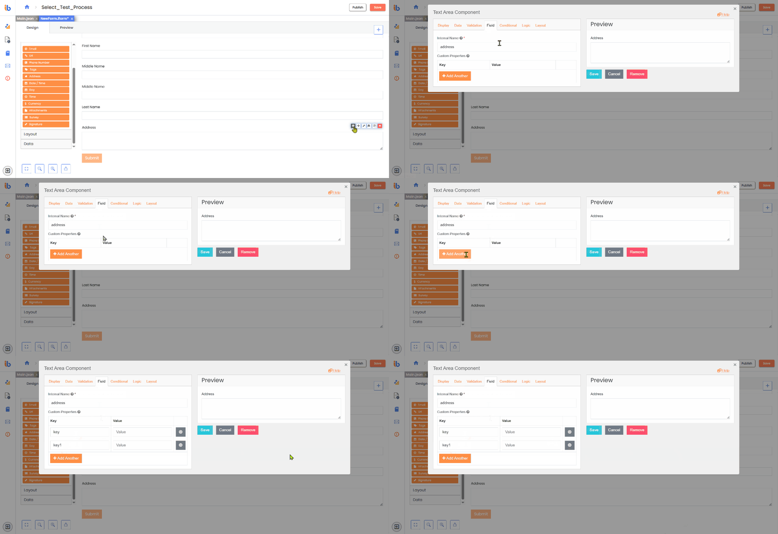
The back-end field contains settings like the Property Name and custom properties like HTML and Tags.

Layout Settings
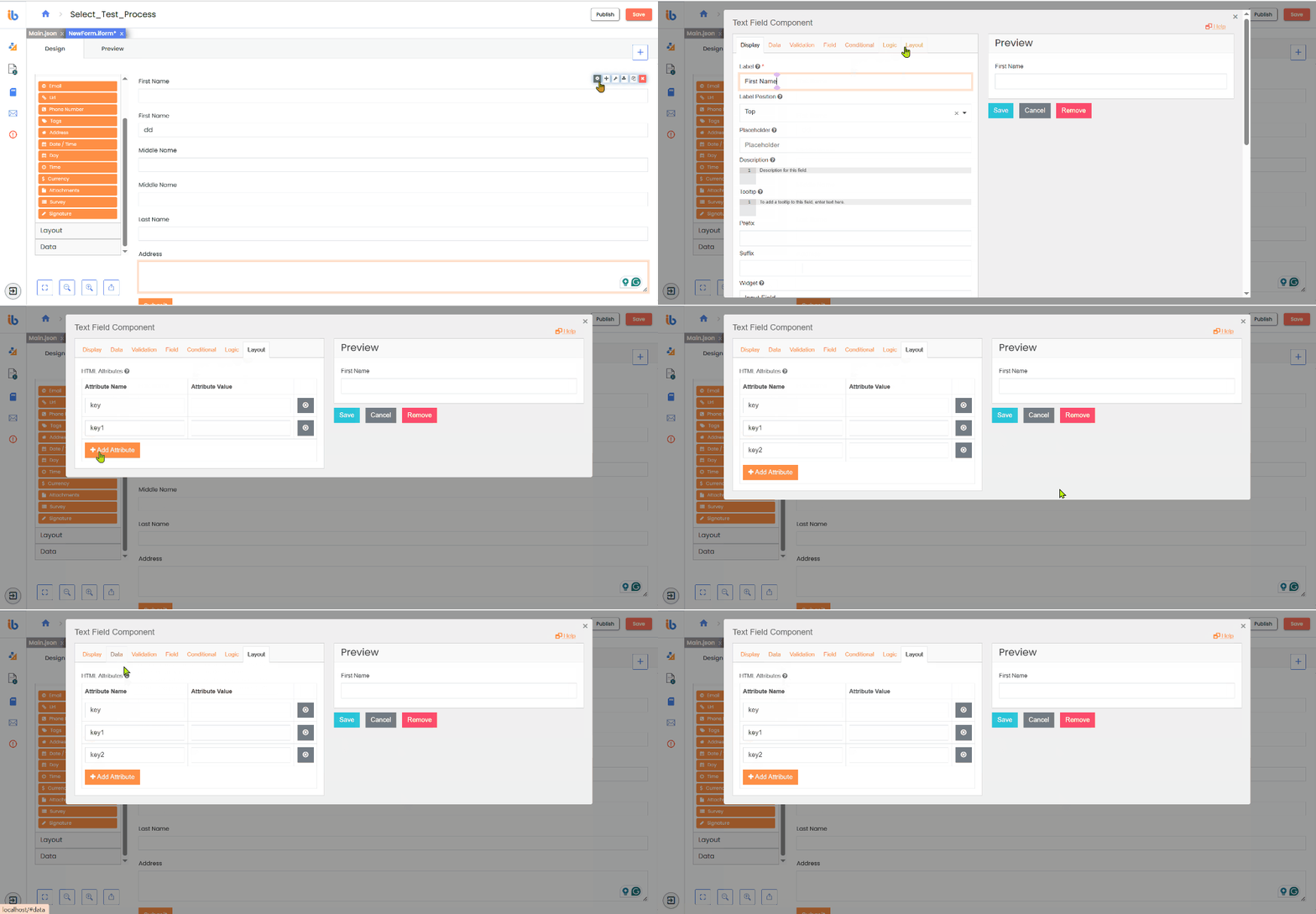
Use the layout settings tab to reposition fields by applying HTML attributes/properties.

Conditional Settings
The Form Designer's Conditional tab allows for component visibility based on conditions. Conditions offer form designers greater power and flexibility, resulting in a more personalized and structured experience for end users when filling out forms.

Logic Settings
The Logic tab of the Form Designer allows you to create conditions and advanced logic scripts that can change the state or the behavior of the selected form component. You can dynamically change a form component's controls, look, and feel using advanced Logic. A form logic consists of two parts: the Trigger and the Action. The Logic feature allows users to implement a rule engine to control and modify field settings, data values, JSON schema, and custom events based on specific conditions. You can apply this feature to each field separately, and users can add multiple instances of Logic to a field if required.

Providers
IntelliBuddies shows several Location and Map providers for fast and easy address lookup and geolocation data.