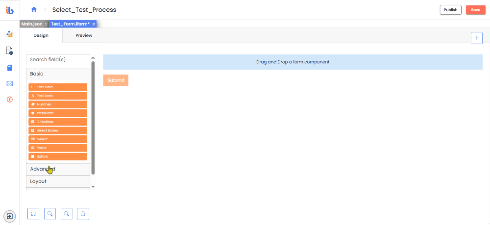
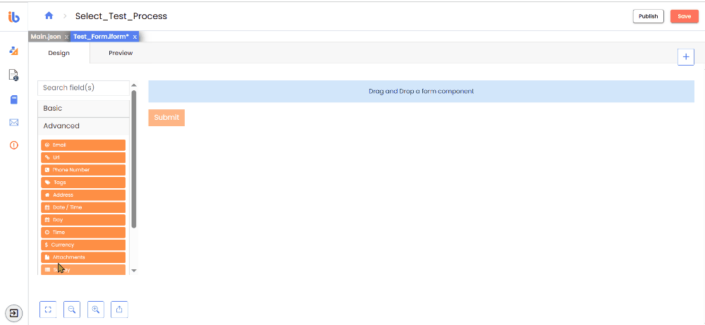
Advance Components
Overview
Advanced Components are Basic Components that are enhanced to meet complex requirements. The information for each Advanced Component includes unique settings, JSON code, and field examples.
Email
The Email component is a string field that validates input to ensure it is in a valid email format. The email address must contain an email prefix and an email domain, both of which must be in an acceptable format. You can ensure that input is in a valid email format by adding the Email component as a string field that validates it. The email address must have an email prefix and an email domain in an acceptable format for validation.

URL
Like the Email field, the URL component is a string field with unique input validation, ensuring the entered data is in a valid URL format. Validation will check to see if the entered input data is in the correct format to potentially be a legitimate URL.
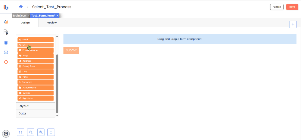
Phone Number
The Phone Number field includes an input mask to ensure proper formatting. Ex: (123) 123-1234
Tags
The Tag component draws attention to or categorizes elements on your form. You can add multiple tags to one Tag field.
- Delimiter: The character used to separate tags
- Max Tags: Specify the maximum amount of tags to add.
- Store As: Select the preferred method for storing tag data when submitting. - String (CSV) - Array of Tags
Address
The Address component is a unique component that performs an address lookup based on user input using several maps and location providers and Custom Provider support. You can enter the address data in free form, and it will save the address, geolocation, and other metadata.
- Enable Manual Mode: When checking this setting, a checkbox appears under the Address field. If the user checks it, the address lookup through the location provider is disabled, and the traditional address field will display for manual input. (Address, City, State, Zip, etc.)
- Switch To Manual Mode Label: What is the label for the checkbox used to activate 'Manual Mode'?
- Disable Clear Icon: Remove the transparent 'x' icon on the right to avoid accidental click.
Date & Time
The Date/Time component is powerful and flexible. It offers various options for validation, date ranges, and calculations using Moment.js.
- Format - Specify the format for displaying the datetime value.
- Enable Date Input - This option allows users to input dates for this field.
- Use Input to add moment.js for minDate - The user can now input for theminDate a date directly instead of using a calendar for the moment function.
- Use calendar to set minDate - The user can utilize a calendar to establish the minimum date by setting minDate.
- Use Input to add moment.js for maxDate - enables the user to use an input for the maxDate moment function instead of a calendar.
- Use calendar to set maxDate - enables the user to use a calendar to set the maxDate.
- Disable specific dates or dates by range - Input the dates you wish to prohibit—for example, 2024-09-15.
- Custom Disabled Dates - This option allows you to ban specific dates.
- Disable weekends - This option allows you to ban weekends.
- Disable weekdays - This option allows you to ban weekdays.
- Enable Time Input - This option allows users to input time for this field.
- Hour Step Size - You can specify the number of hours that must be incremented or decremented in the time picker.
- Minute Step Size - You can specify the number of minutes that must be incremented or decremented in the time picker.
- 12 Hour Time (AM/PM) - Use this option to display time in 12-hour periods, using AM or PM.
- Default Date - You can set the default value to a specific date using Moment.js functions. For example, you can use the following function: moment().substract(20, 'days').
- Flatpickr options - A raw JSON object containing configuration options for the Date/Time Component (Flatpickr).
Day
You can use the Day component to enter the Day, Month, and Year values using a number or select field type.
- Type / Type of input - Choose Day, Month, or Year by typing or selecting from a dropdown.
- Minimum / Maximum Year - Choose the minimum / maximum year.
- Require Day - Using this option, enforce the Day field to be filled in before the form renders.
- Require Month - Using this option, enforce the Month field to be filled in before the form renders.
- Require Year - Using this option, enforce the Year field to be filled in before the form renders.
- Maximum / Minimum Day - Choose a minimum / maximum day. You can also use Moment.js functions. For example, you can use moment().add(25, 'days').
- Default value - This is the field's initial value before any user input. Setting a default value will replace any placeholder text. - Month - Define the default month to be displayed. - Day - Set the default day for the field. - Year - Specify the default year to be shown.
Time
You can add a stand-alone time field or a time selector widget for manual input.
- Input Type - Choose the widget you want to use to input the time.
| Input Type | Description |
|---|---|
| HTML5 Time Input | Users can choose the time from a given panel |
| Input with Mask | users can manually input the time |
- Data Format - Specify the format used by moment.js to store the value of this field. The default format is set to HH:mm:ss.
Currency
Use the Currency component when a field should display currency amounts on the field. This component holds a numeric input mask that allows two decimal values and automatically adds commas as a user inputs a currency amount. You can select the type of currency, which will change by adding a currency symbol in the prefix.
- Currency - Click on the dropdown list to choose a currency or type its name to search.
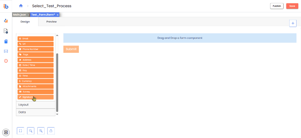
Survey
The Survey component operates in a similar way to the radio function. Instead of only one question, users can select values for multiple questions set up within the component settings. Surveys are helpful when asking questions requiring the same context of answers or values.
- Questions - Input the questions the users must answer.
- Values - Include the available options for users to choose from for each question.
Signature
The Signature component allows one to sign manually through the pen component. Click the refresh icon in the top left corner to clear the signature.
Attachments
Use the Attachment component to upload and download files within a form. You can configure the storage of files inside the File tab, which appears when you click on the settings of the Attachments field.