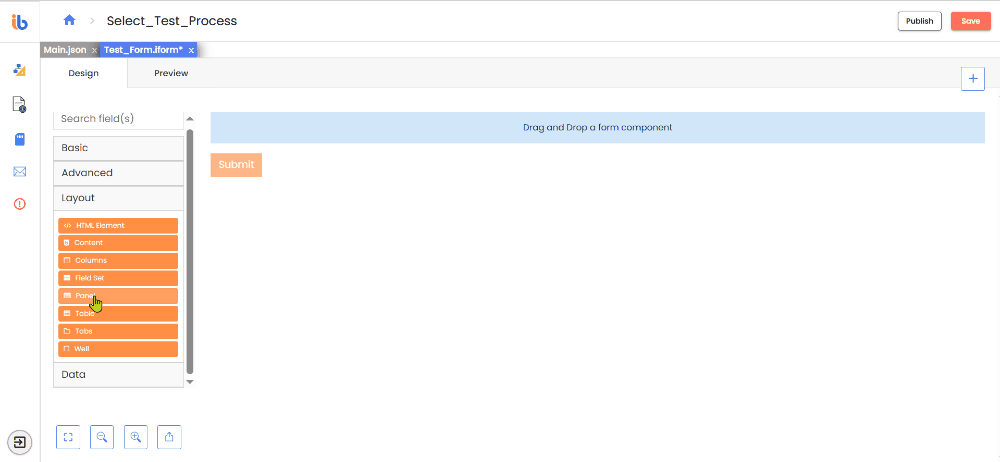
Layout Components
Overview�
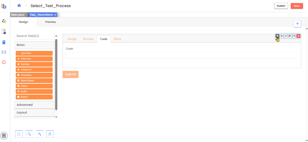
Use layout components to adjust the position of fields on a form. Add logos, headers, and contextual language using HTML or a WYSIWYG editor. You can find information for each of the Layout Components, like unique settings, JSON code, and field examples, below:
HTML Element
You can add an HTML Element component to your form to display a single HTML element quickly and easily. It is a helpful feature if you want to insert and configure some HTML in your form without hassle. It sanitizes all potentially unsafe HTML to prevent cross-site scripting attacks. It includes tags such as script, embed, and style, and attributes like onmouseover or onload.
- HTML Tag: Specify the name of the HTML tag to display.
- CSS Class: Specify the CSS class to add to the HTML Element. To specify multiple classes, separate them with a single space.
- Attributes: Specify the Attributes and their values to add to the HTML Element. It commonly adds href attributes to a tags or src attributes to img tags.
- Content: By adding child HTML tags or using the Content component for previewing complex HTML, you can easily display the text content of an HTML Element.
- Refresh on Change: This option causes the HTML element to refresh whenever a value in the form is modified. It can be beneficial when you want the element to display updated data from other components after you fill in during form completion.
Content
You can add a Content component to include contextual language, headers, or media in a form without any field information. It is beneficial to display instructions at the top of a form. However, it's essential to remember that it will not submit the value of the Content component back to the server. It provides a WYSIWYG editor to help with formatting the content. If you use the HTML view of the editor, note that it strips all unsafe HTML before rendering to prevent cross-site scripting exploits. It includes tags like script, embed, and style, and attributes like onmouseover or onload.
- Heading: Choose a Heading one - three or Paragraph
- Font Family: Select your font style preference
- Font Size: Change the font size from large to small
- Font Emphasis: Add bold or italic emphasis to the content
- Link: Add a hyperlink to the form
- Indent: Increase or decrease the indent of the text
- Insert Media: Add an image from your local machine and or add an online video via URL
- Align: Align the text Left, Center, or Right
Columns
You can use this component to group different components into columns, like Text Field, Text Area, Checkbox, etc. Columns can help you display multiple components in a single line or save space on your form.
- Column Properties - Add columns to the component and adjust their layout using Width, Offset, Push, and Pull properties. Then, drag and drop other components into the Columns component.
- Auto adjusts columns - If there are any nested hidden components, it adjusts columns automatically.

Field Set
When creating a form, use a Field Set to give a title to a particular section or a group of components. It is beneficial when placing it within Layout components or between many related components. It's important to note that the Field Set is only for display purposes and will not save to the API.
Panel
A Panel wraps groups of fields and adds a title and styling. Organize components and create an appealing UI—styling maps to Bootstrap Card Header and Footer.
- Theme - Choose a theme for the panel by selecting an option from the dropdown menu. The wrapper div will have the Bootstrap class.
- Collapsible - You can collapse the panel using this option.
- Initially Collapsed - The panel will collapse if you select the Collapsible option upon the form's loading.
Table
You can create a table with form components inside its columns and rows using the Table component.
- Number of Rows / Columns - Indicate the number of rows or columns to view in the table.
- Clone Row Components - When creating tables with repetitive content in multiple rows, you can use this function to clone the components and add them to the remaining rows.
- Cell Alignment- Select the horizontal alignment for the cells in the table.
- Striped - This option adds shaded stripes to the rows.
- Bordered - This option adds visible borders to the table.
- Hover - This option highlights the row when the user hovers the mouse.
- Condensed - Reduces the dimensions of the table.
Tabs
This particular feature allows for grouping various sets of fields into separate tabs. Like a Wizard flow, users can conveniently switch between tabs using a navigation bar with tab buttons, each opening a different set of components. Only one tab displays at a time in a rendered form. It's essential to note it maps the Tab CSS currently to Bootstrap Navs.
-
Tabs: This is a data grid that enables users to add, configure, reorder, and remove tabs.
-
Vertical Layout: The navigation bar can be changed to display vertically instead of horizontally.
Well
Use a well field to distinguish a particular section of the form. The div tag encloses it with a class associated with Bootstrap Cards.