Data Components
Overview
Data components refer to fields controlling how data is organized, saved, and displayed.
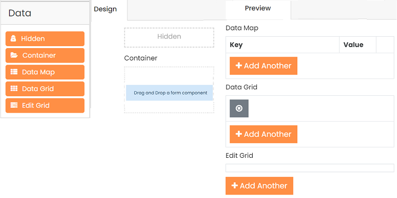
Hidden
The hidden component is a versatile tool for the form designer. Although there is no widget or display on the front end, it is visible within the form designer. The Hidden component can efficiently handle behind-the-scenes calculations or logic to support more advanced workflows in your form or application.
Container
A Container is a wrapper around a set of fields, similar to a Field Set. What makes the Container unique is the way the data is stored. It puts the fields inside the Container into an object with the container key. It helps create more complex objects and data sets within your form.
Data Map
A Data Map component allows users to create key/value pairs. The key and the value fields can get the values while filling out the form. New pairs can be added to the form by the Add Another button and removed by the X (Remove Row) button.
- Label for Key Column: A label text for a Key column. Uses the Key label by default if it is left empty.
- Disable Adding / Removing Rows: The Add Another and Remove Row buttons will be hidden.
- Show Key Column Before Value: Display the Key column before the Value column. If unchecked, the Value column appears first.
- Add Another Text: The text for the Add Another button is being set.
Data Grid
Users can efficiently utilize Data Grids to group components in a line item grid. Users can add multiple rows of component groupings for maximum convenience. In addition, adding or duplicating multiple fieldsets is made more straightforward, as it includes any number of grids within a form.

- Disable Adding / Removing Rows: You can hide the Add Another and Remove Row buttons using this option.
- Conditional Add Button: Indicate the criteria for when the Add Button should appear.
- Allow Reorder: Once activated, the user can rearrange the rows in the Data Grid.
- Add Another Text: This option allows you to change the text displayed on the Add Another button.
- Add Another Position: You can specify a position for the
Add Anotherbutton for the Data Grid. The button can be simultaneously at the top of the Data Grid, bottom, or both places. - Allow Reorder: Allows reordering rows by dragging and dropping them.
- Equal Column Width: Makes the column sizes equal width.
- Enable Row Groups: Allows separating Data Grid rows into groups. You can add groups, specify their labels, select several rows in certain groups, and delete them. It's helpful if you want to set a specific number of rows in the Data Grid and separate them by groups (see an example below).
- Hide Group on Header Click: Makes the group header clickable. When clicked, the whole group collapses. When clicked again, it expands and shows the hidden rows.
- Initialize Empty: Hides all visible rows when initialized.
Edit Grid
The Edit Grid component functions similarly to a table, allowing for the efficient capture and display of form data. You can add multiple components to the grid and a form, which helps add or copy multiple fieldsets. The Edit Grid also provides flexibility in saving and displaying data rows customized to suit the end user's needs.
-
Inline Editing - Select this option if you want changes made in edit mode to be saved directly to the submission object as each Row is updated.
-
Open First Row When Empty: When the form is loaded, a row is displayed for the user to fill out. If you turn off the required option in the setting, the Row must be completed and saved before submitting the form.
-
Disable Adding / Removing Rows: To remove the
Add AnotherandRemove Rowbuttons, utilize this option. -
Display Edit Grid as Table: Uses the Table template for rendering the Data Grid.
-
Conditional Add Button: Set a condition to determine when the Add Button will appear.
-
Header, Row, and Footer Templates: Customize the grid using basic JavaScript. Modify components displayed in saved grid rows and header/footer in the Template section of component settings.
-
Add Another Text: Sets the text of the
Add Anotherbutton. -
Display As Modal: Shows up the form layout to add or edit a data entry in a modal view.
-
Save Row Text: Sets the text of the
Save Rowbutton. -
Remove Row Text: Sets the text of the
Remove Rowbutton.