Basic Components
Overview
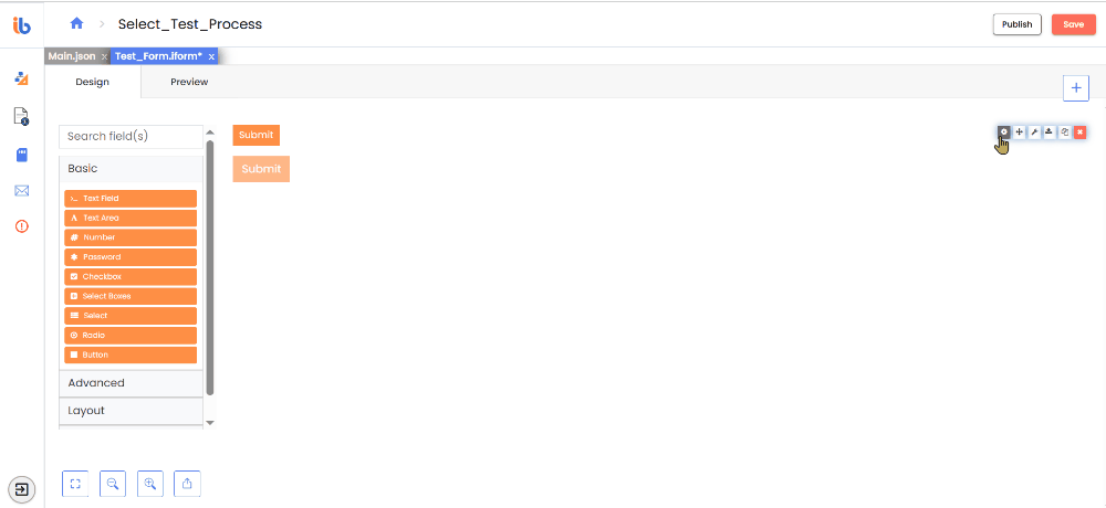
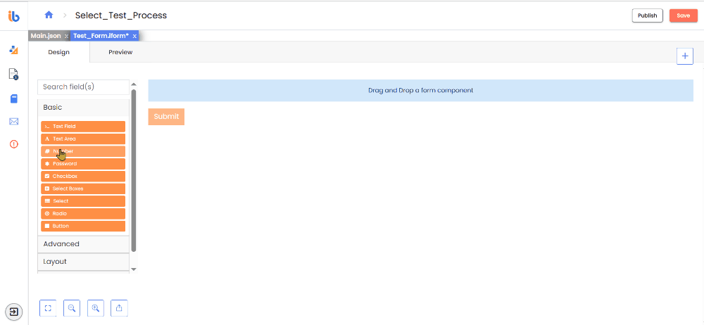
The IntelliBuddies Form Designer includes a collection of basic components on the left panel, similar to those found in traditional web forms. Each component has its own configurable settings, JSON code representation, and example fields to guide setup and customization.
Following are the basic components:
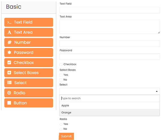
Text Field
You can use a Text Field to input short and general text. Options to define input masks and validations allow users to format information as desired.
Text Area
The Text Area component offers multi-line input and allows you to input long text. The Rows setting determines the number of visible rows.
Number
The Number component allows you to input any numerical value.
- Use Thousands Separator - Enable this to separate numbers with a locale-specific thousands delimiter (e.g., commas) for clarity.
- Decimal Places - Set the maximum number of decimal places to display, allowing precision control.
- Require Decimal - Enable this option to display decimal values, including zeros consistently.
Password
You can input passwords using the Password component, which displays asterisks instead of the actual value for security.
Checkbox
You can use a checkbox to input a boolean value. It can be either checked (true) or unchecked (false). There are options to set a shortcut and input type.
Select Boxes
This component allows users to select multiple options in checkbox format. The Data tab allows you to customize settings like value shortcuts and validation.
- Values—Values allow you to add options to the Select Box component, with the Label column representing the value visible to users and the Value column representing the stored data name.
- Data Source Type - See Data Source Type for more details.
Select
The Select component allows users to select from a list of values in a dropdown menu. It offers flexibility regarding the data source, and various settings for filtering, querying, and loading data values are available.
Data Source Type
Choose the data source type to use when selecting data. Values allow you to provide custom values and labels. JSON enables you to supply raw JSON data. URL permits you to supply a URL to retrieve the JSON data.
| Type | Description |
|---|---|
| Values | Choose this option to provide your own values and labels. |
| URL | Choose this option to provide a URL to retrieve the JSON data. |
| Custom | Choose this option to provide value through custom code. |
| Raw JSON | Choose this option to provide raw JSON data. |
- Data Source URL - A URL that returns a JSON array to use as the data source.
- Request Headers - Specify any headers to include with the request to the URL, such as those required for authentication.
- Lazy Load Data - This option delays the API request to the specified URL until the control is focused. This approach optimizes performance, especially when multiple Select dropdowns are present, as it triggers the API calls only on user interaction.
- Data Path - The source data property where iterable items reside.The object path to the iterable items. For example: results.items or results[0].items.
- ID Path - Path to the select option id.
- Value Property - Specify the property within each data source item to use as the selectable value. If left unspecified, it will use the entire item. It defines the saved property of the selected item.
- Disable limiting response - When enabled, the request will not include the limit and skip options in the query string.
- Search Query Name - The delay in seconds before sending the request, measured from the last character input in the search field. There is a delay (in seconds) before sending the search request.
- Search request delay - The delay in seconds before sending the request, measured from the last character input in the search field. There is a delay (in seconds) before sending the search request.
- Item Template - The HTML template for the result data items.
- Filter Query - Use this to provide additional filtering using query parameters. The filter query for results.
- Sort Query - Use this to provide additional sorting using query parameters. The sort query for results.
- Limit - This limits the number of items to request or view. Maximum number of items to view per page of results. By default, set to 100.
- Refresh Options On - Refresh data when another field changes.
- Refresh Options On Blur - Refresh data when another field is blurred.
- Clear Value On Refresh Options - Check this option. Clear this component value when the Refresh Options On field changes.
- Read-Only Value - Check this if you would like to show just the value when in Read-Only mode.
- Choices.js options - A raw JSON object to use as options for the Select component (Choices JS).
- Disables Storing Request Result in the Cache - Check if you don't want the requests and their results stored in the Cache. By default, it stores, and if the Select tries to request the same URL with the same parameters, it will return the cached data. It allows for increased performance, but uncheck this option if the remote source's data changes quite often and you always need to keep it up-to-date.
- Use exact search - Disables search algorithm threshold.
Radio
The Radio component lets users choose a single option from a list displayed in radio button format. Users can click the selected option again to deselect it, returning the field to its default state.
- Values—Enter the values from the list. The Label column is displayed to users, while the Value column is stored in the database.
- Data Source Type - See Data Source Type for more details.
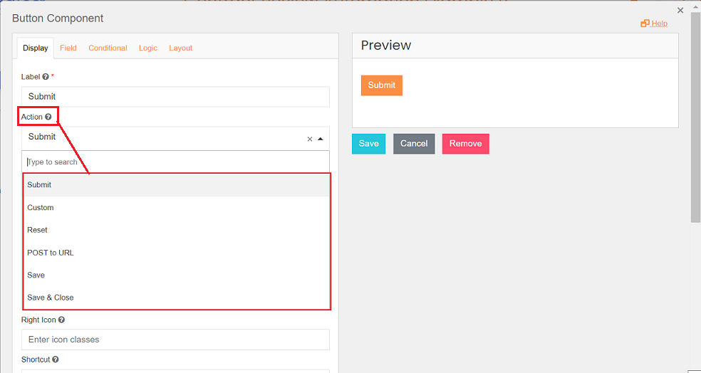
Button
The Button component allows you to perform various actions within your form. While typically used for form submission, it can also trigger workflow events, reset fields, authenticate users via OAuth, and more. The component also provides several options to customize its style and theme.
- Action - Select the action you want the button to perform:
| Action | Description |
|---|---|
| Submit | Submit the form and complete the associated task. |
| Custom | Executes custom logic specified in the Button Custom Logic field. |
| Reset | Use this option to reset the form fields. |
| POST to URL | Submits the form to the URL and any headers specified in the Headers section. |
| Save | Saves the form as a draft. The user has to perform a Submit action to complete the task associated with the form. |
| Save & Close | Saves the form as a draft and closes it. |
-
Theme - From the dropdown list, you can select the color theme for the button. The following table describes all supported themes:
Theme View Description Primary 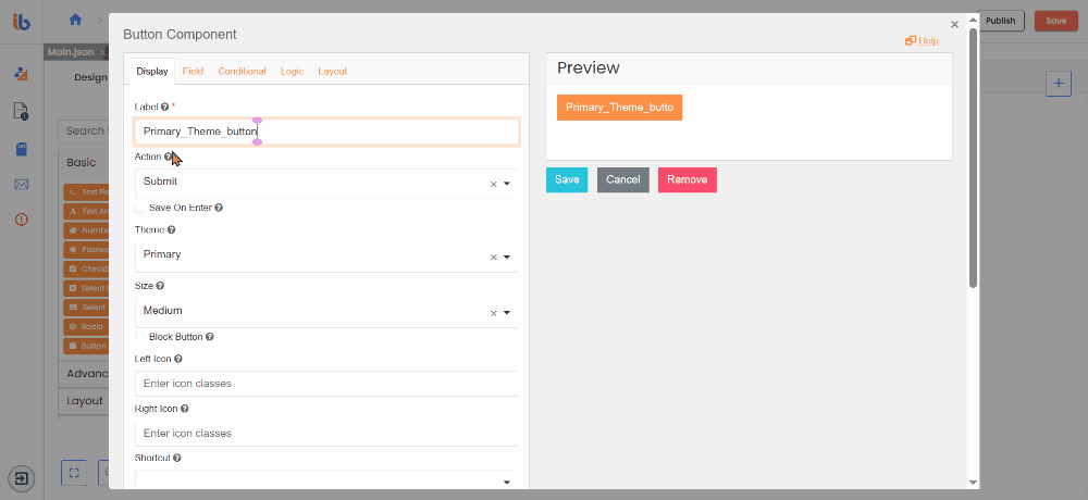
Choose this option to set the theme as Primary. Secondary 
Choose this option to set the theme as Secondary. Info 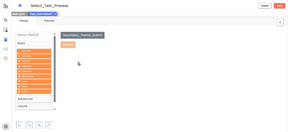
Choose this option to set the theme as Info. Success 
Choose this option to set the theme as Success. Danger 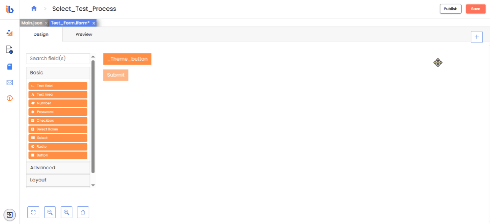
Choose this option to set the theme as Danger. Warning 
Choose this option to set the theme as Warning. -
Size - Select the button size (Small, Medium, Large) from the dropdown list.
Size View Description Small 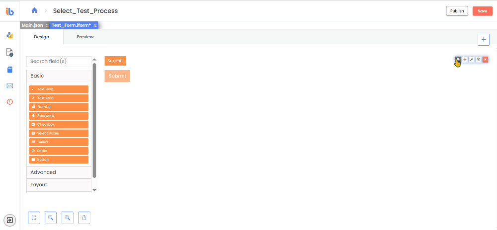
Choose this option to set the small size of buttom. Medium 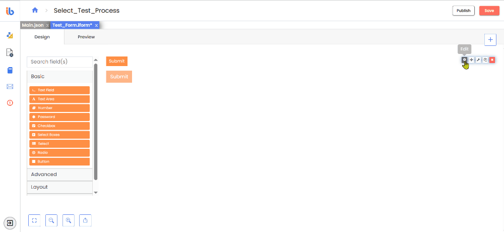
Choose this option to set the medium size of buttom. Large 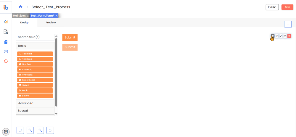
Choose this option to set the large size of buttom. -
Block Button - The stretch covers the entire width of the bounding container.
-
Left / Right Icon - Add an icon by specifying the icon class string (e.g., "fa fa-plus").