Bind Forms
Overview
The form binding to a data source technique is beneficial for bringing data from any supported sources, such as Connections & Lists, and populating a form with the necessary data. You can also filter the data with necessary queries, making it easier to find what you need.
Bind Form Data
For most form controls, you can only bind the Value property with a data source field. However, a few controls allow you to bind some extra properties with data source fields. To learn more about those controls and their bindable properties, please refer to Bindable Form Control Properties.
For any of the properties, follow the steps below to bind them with the corresponding data source fields.
-
In the Project Explorer Panel, expand the forms node.
-
Select the form for which data and events need to be bound.
-
Right-click and select Bind Data and Events menu option.
-
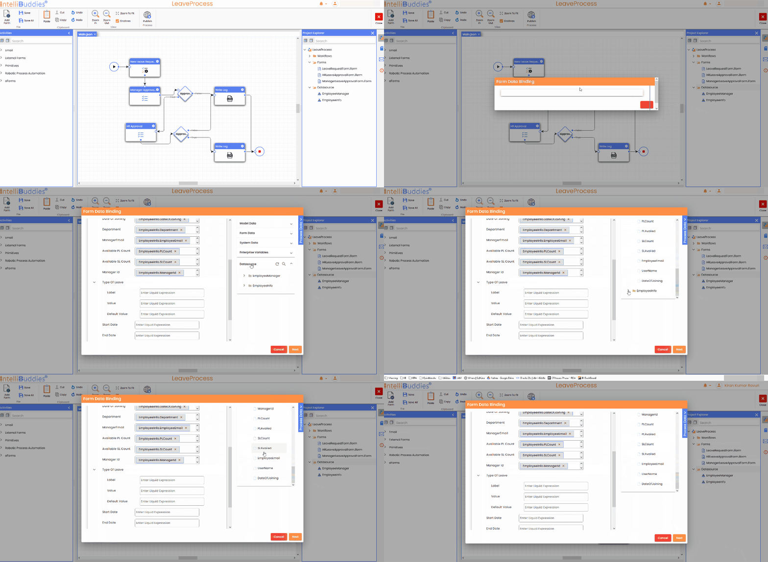
It will bring up the Bind Data and Events dialog.
-
Configure the binding and Save
-
The columns selected in the Data Source will be listed under the DataSource category in the Process Data Panel.
-
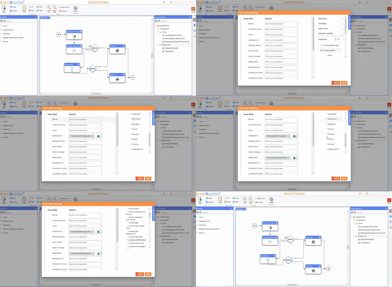
During form designing, you can map the fields in any configured data source.
Bindable Form Control Properties
For the following form controls, along with the value, you can also bind other properties based on the type of control.
You cannot bind fields from two different data sources for a single control.
Select
You can bind the following properties for the Select control.
| Property | Description |
|---|---|
| Label (Display Name) | Specifies the display name for the select field. |
| Value | Specifies the values to utilize as corresponding data sources. |
| Default Value | The field's default value is set and showcased within the respective field. |
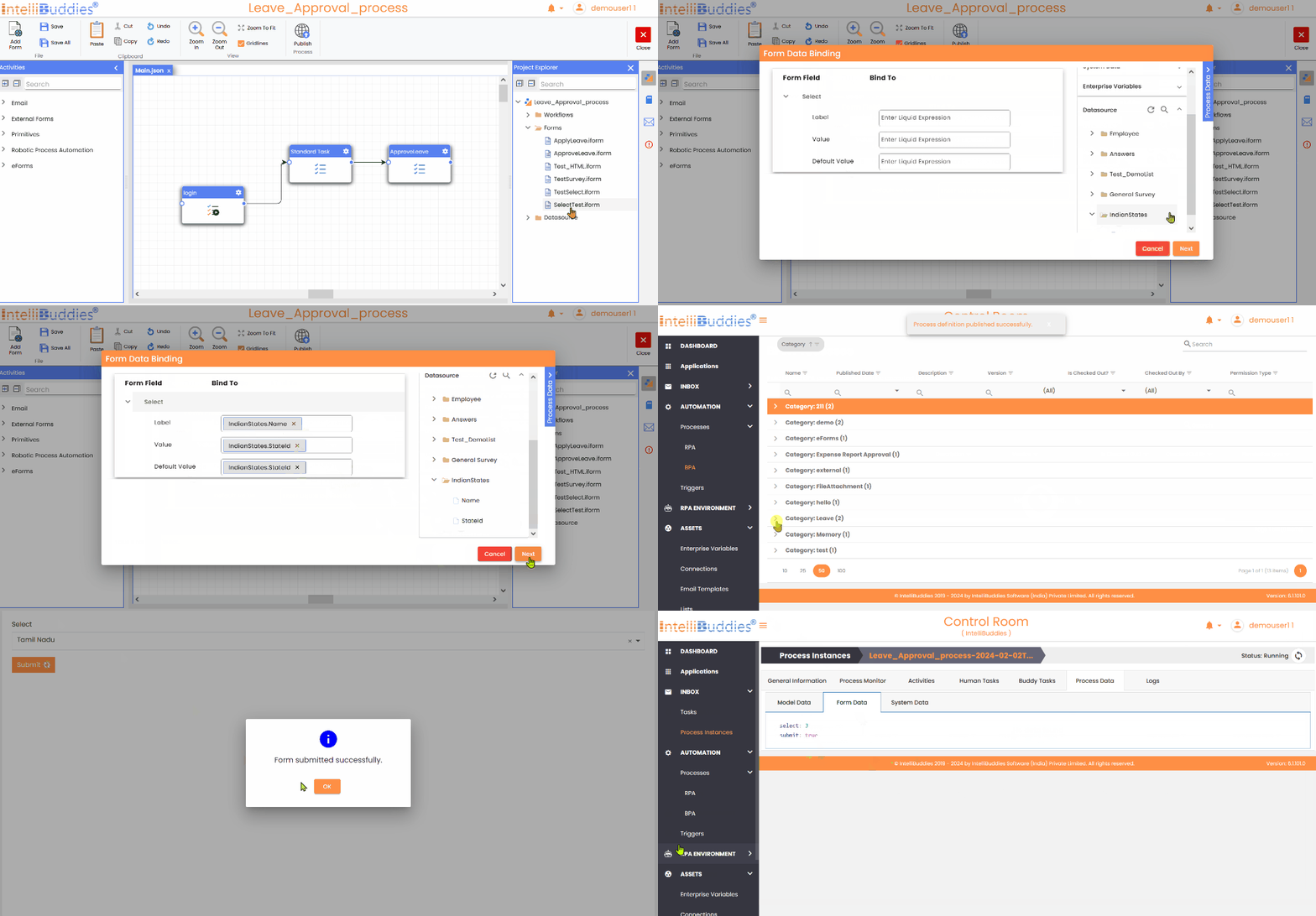
Here is a demonstrative example of property mapping for the Select:
Select Boxes
You can bind the following properties for the Select Boxes control.
| Property | Description |
|---|---|
| Label (Display Name) | Specifies the display name for the select field. |
| Value | Specifies the values to utilize as corresponding data sources. |
| Default Value | The default value for the field is set and showcased within the respective field. |
Below is an example illustrating the mapping of properties for the Select Boxes control:
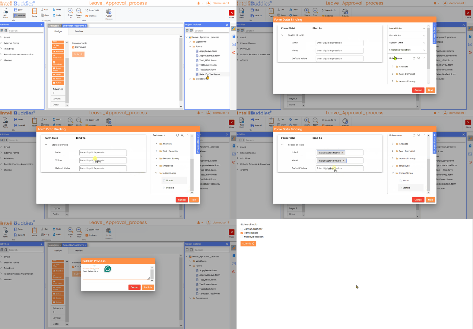
Radio
You can bind the following properties for the Radio control.
| Property | Description |
|---|---|
| Label (Display name) | Specifies the display name for the select field. |
| Value | Specifies the values to utilize as corresponding data sources. |
| Default Value | The default value for the field is set and showcased within the respective field. |
Here is an example of mapping for Radio control properties:
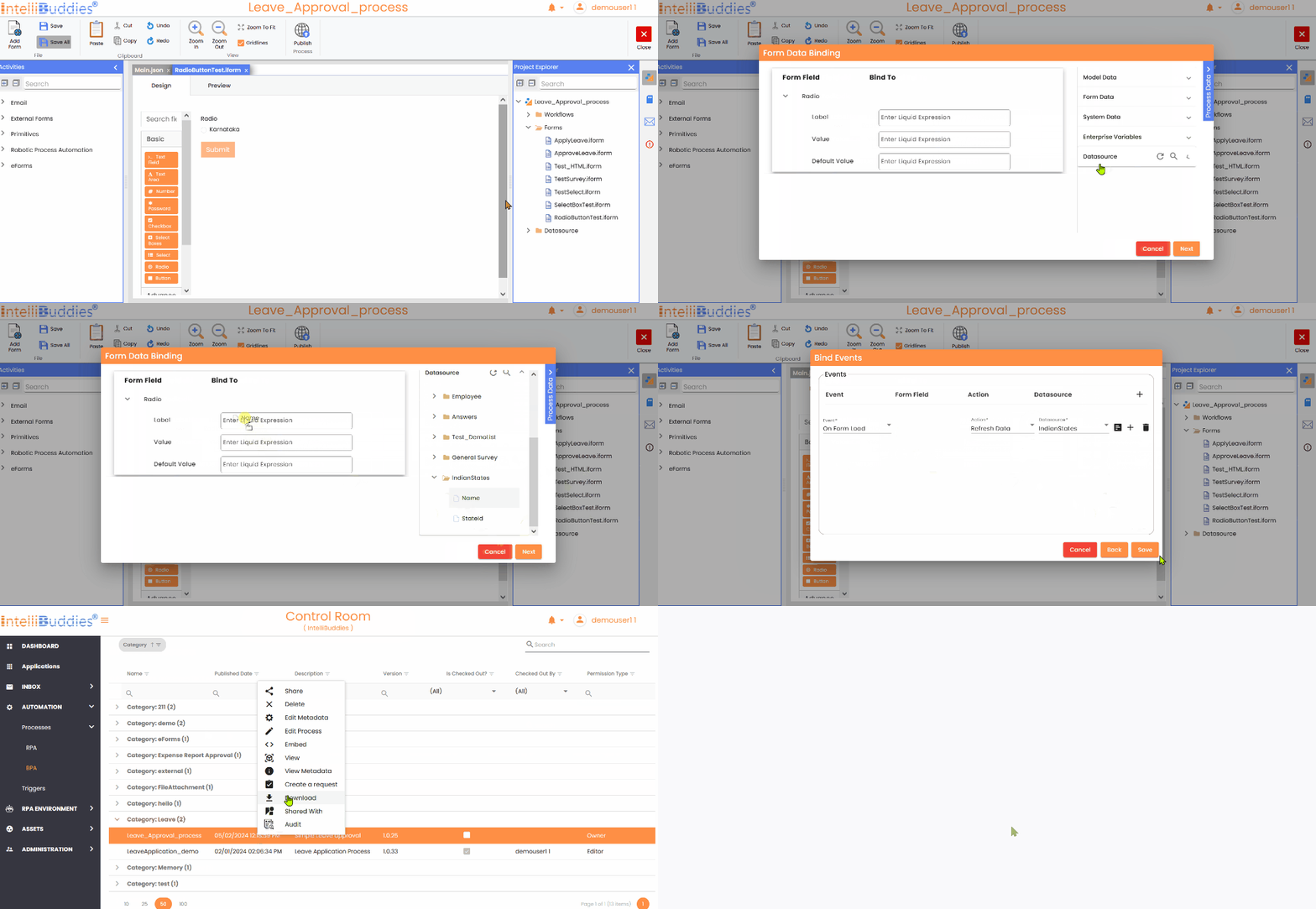
Survey
You can bind the following properties for theSurvey control.
| Property | Description |
|---|---|
| Label (Display name) | Specifies the display name for the select field. |
| Value | Specifies the values to utilize as corresponding data sources. |
| Tooltip | Specifies the tooltip for the values selected. |
| Default Value | The default value for the field is set and showcased within the respective field. |
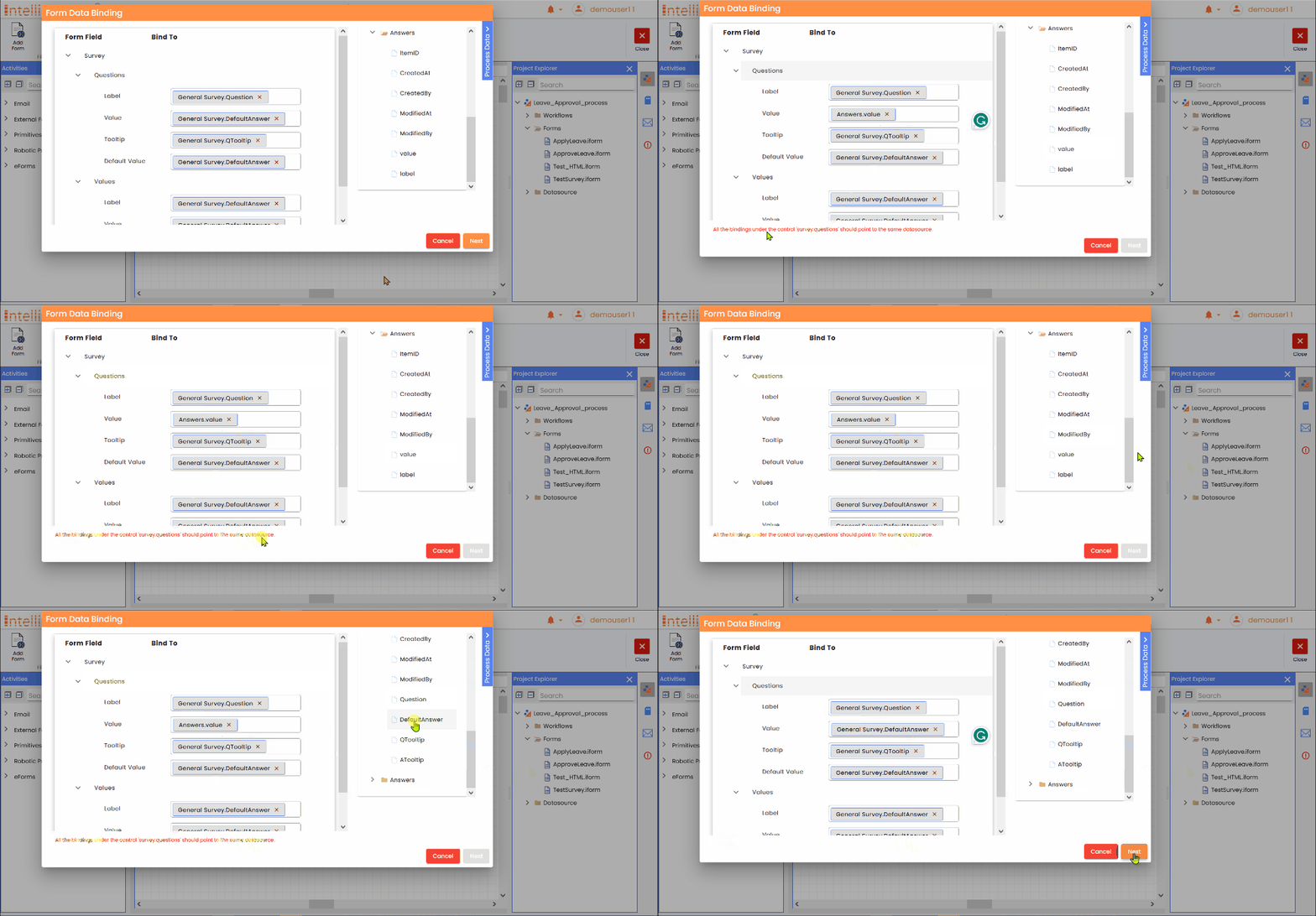
Here is an example of mapping for Survey control properties:
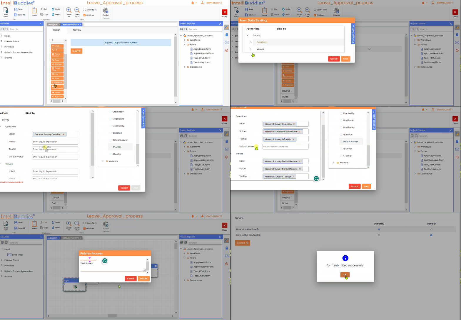
Configure Events
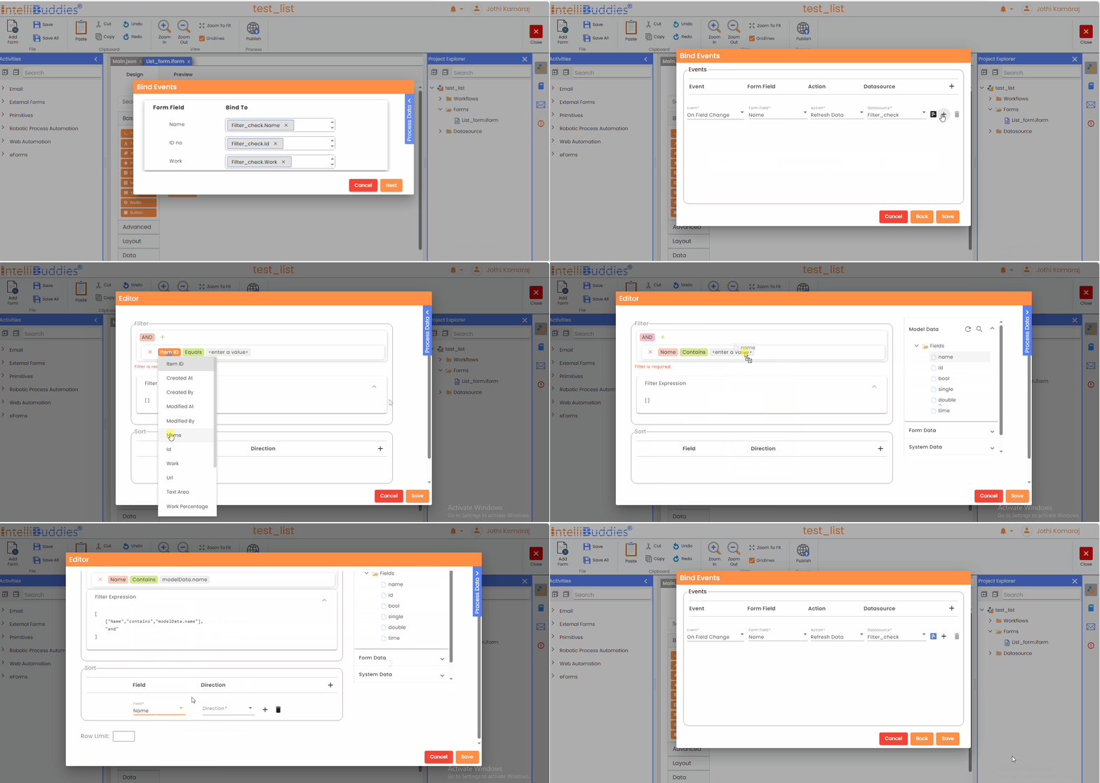
- Move to the next tab using the Next button once you bind.
| Event | When you want to load the data from the data source either on form load or a field change. |
| Form Field | The form field on whose change you want to execute your filter. This option is only available with On Field Change events. |
| Action | The action to perform on the filter execution. |
| Datasource | The data source to perform the action selected. |
- We can add multiple events for each data source based on one's requirements.
Configure Filter
- Once configuring the event, click the editor beside the datasource field to open the filter builder.
- On form load, if you add no events, all data sources used in the bindings will refresh by default.
Filter
Filter dialog allows you to create filter expressions and apply criteria to extract desired values.
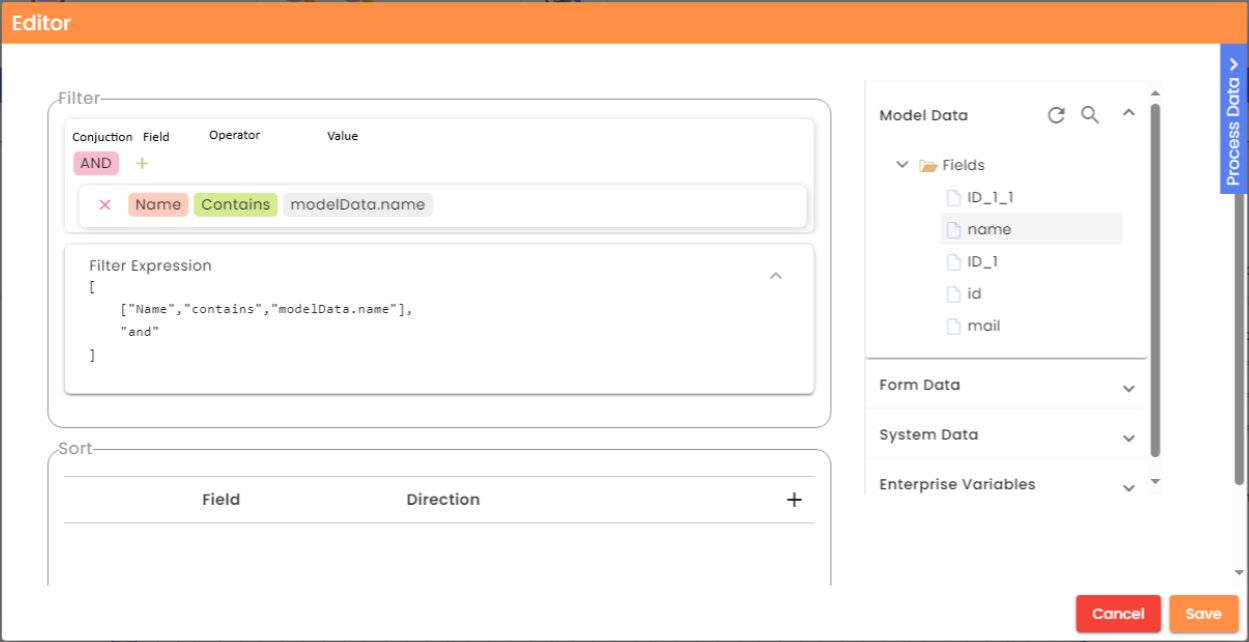
| Conjunction | Specify the conjunctive operation to perform, either 'AND' or 'OR' |
| Field | Specify the data source field to filter. |
| Operator | Specify the evaluation operation to perform on the field. The operator will change according to the field data type. |
| Value | Specify the value with which you want to evaluate. You can type in or drag-drop any field from the Process Data panel apart from the data sources. Note: If the data type of the value being dragged and dropped does not match the data type of the field, an error message will be displayed instead of copying the value. |
Building filter expressions
- Click on the + button available in the dialog
- Select the field from the dropdown menu to filter the columns in the data source.
- Select the appropriate conditional operator from the dropdown menu.
The list of conditional operators changes dynamically depending on the selected field.
- Specify the desired value for the filter.
If you require constructing a complicated expression, you can include additional expressions by joining them with suitable conjunctions.
- Click on the + button
- Select the conjunction from the dropdown
- Continue building expressions
Expression Grid
| Column | Description |
|---|---|
| Logic | Select the logical conjunction from the dropdown menu to combine the expressions |
| Filter Field | Apply the filter by selecting an option from the dropdown menu for the chosen field |
| Condition | Select the appropriate conditional operator from the dropdown menu to use in the expression. |
| Value | Specify the value for the chosen field to use for filtering |
Logical Conjunctions
| Option | Description |
|---|---|
| AND | The selected expressions will undergo a logical AND operation. |
| OR | Performs logical OR operation between the fixed terms |
Filter Fields
- Fields are respective Datasource columns.
Conditional operator
| Data Type | Operators |
|---|---|
| String | contains, notcontains, startswith, endswith, = , <> , isblank , isnotblank |
| Numeric | = , <> , < , > , >= , <=, between , isblank , isnotblank |
| Date, DateTime | = , <> , < , > , >= , <=, between , isblank , isnotblank |
| Boolean | = , <> , isblank , isnotblank |
Value
- You can give literal values or drag-drop any field from the Process Data panel apart from the data sources.
If the drag-drop values datatype does not match the field datatype, the value will not copy; instead, an error message will appear.
Sort
| Field | Specify the data source field to apply the sorting. |
| Direction | Specify the direction of the sorting, either Ascending or Descending. |
Row Limit
- Specify the total number of rows to return.
Validation
- Error Panel would display all the validation errors due to improper binding.
- Validation is applied to both Lists and Connections datasources.
- Datasource validation errors are also displayed in the respective Form-data-binding dialog.